Big images, blazingly fast
Optimizing full-screen images for Rijksmuseum’s story platform


We go to museums to be moved. We are stunned by artworks of steel, glass or bronze. We marvel at images from times near and far. We revel in paintings, photographs and sketches.
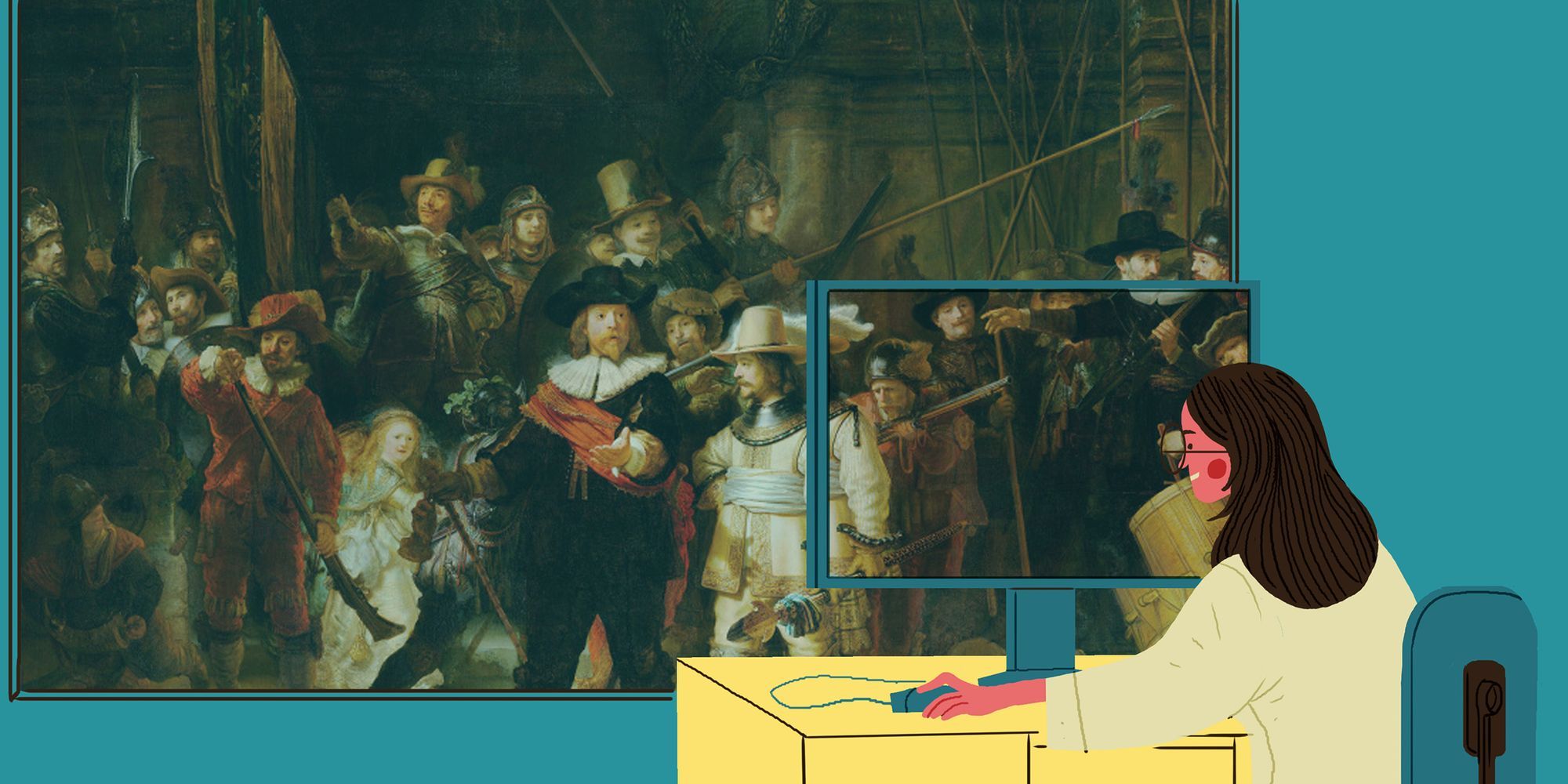
The most visited museum in the Netherlands, the Rijksmuseum in Amsterdam, aims to retain this visual impact in its online presence. In November 2020, the Rijksmuseum’s website underwent a complete metamorphosis, with full-screen images taking centre stage.
For the development team at Q42, the challenge lay in optimizing those images to make them load blazingly fast on every display. Regardless of device type or screen size, visitors should also see the correct crop and aspect ratio.
In HTML5, the `srcset` and `sizes` attributes are tools to make images responsive. Used correctly, they ensure that your website downloads the correct image for every screen size. This works fine for the majority of websites: most images scale to smaller resolutions on smaller screens, and media queries changing the layout of the website often also respond to screen width.
However, `srcset` and `sizes` are not the end-all. There are cases in which it is simply impossible to make images properly responsive through the use of this technique alone. This is due to one nasty limitation: these attributes only work with image width.
While developing the new Rijksmuseum website, we quickly discovered that `srcset` could not make our images fully responsive. The size of the image depends on both a viewport’s width and its height. Using only a naive `srcset` setup to make those images responsive didn’t work for our case.
In this article, I explain how we went about optimizing full-screen images for the Rijksmuseum website, retaining the source image’s properties, and realizing savings in data transferred to the user while still delivering the biggest images for an impactful experience.
Big Images Everywhere: serving responsive images with Sizes and Srcset
Let’s first quickly cover the basics of optimizing images on a website before we dive into the specifics for our height-dependent images. These optimizations make sense for every image on every website, so you should start here!
The first thing you do to optimize the images on your website is making them responsive. If you don’t know why you should use the srcset and sizes attributes, or how, I recommend this solid read about them on web.dev, or this more detailed one on MDN. Now if you do know about them, it is a good idea to take a critical look at how you implement them. There is a quick - and dirty - way. This I know, because I used to take it myself. I see lots of guides that don’t bring it much further. While it is better than doing nothing, taking a bit more time to optimize them can make a big difference!
🇳🇱 👋 Hey Dutchies!
Even tussendoor... we zoeken nieuwe Q'ers!
Let’s take a look at this quick and dirty way of implementing responsive images, and what can be improved. The really quick way of implementing responsive images is using a fixed srcset for all your images. For example: serving every image with 320, 640, 1280 and 1920 pixels in width. However, if you do not supply the sizes attribute, the browser will assume the images’ width is 100vw (or viewport width). What often happens then is that, even for normal-sized images, the browser will download an image that is far too big, costing users a lot of data and making sites load slower.
While adding an accurate `sizes` attribute is crucial, the `srcset` should fit that sizestring as well. For example, if we have an image with a width of 100vw, but a max-width of 700px (so sizes=”(min-width: 700px) 700px, 100vw”), the quick and dirty srcset in the example above would be disastrous:
- On the average smartphone (with a viewport of 375 pixels wide, and a device pixel ratio of 2.0), the browser would like to download a 375 * 2.0 = 750px wide image. But the next best thing in our srcset is the 1280px wide image; 171% bigger in width alone.
- On desktop, the image’s width will hit the limit of 700px, but we don’t have that size in the srcset, so on desktop it will also download the 1280px image, 183% of what we need in width.
This means you should also make sure your srcset provides the right image sizes for the images on your site! An easy solution is to just provide more different sizes in your srcset, which will work for most websites. The best way, however, is to tailor your srcset completely to the `sizes` attribute of the image and the screen resolutions of your visitors’ device. For the Rijksmuseum website we wrote a service that would generate a srcset for an image tailored to the `vw` sizes of the image, and the most popular screen resolutions that visited the website. That could generate something like this for desktop resolutions of 1024, 1440, 2048 and 2880 pixels wide:
Fullscreen everywhere on the Rijksmuseum’s website
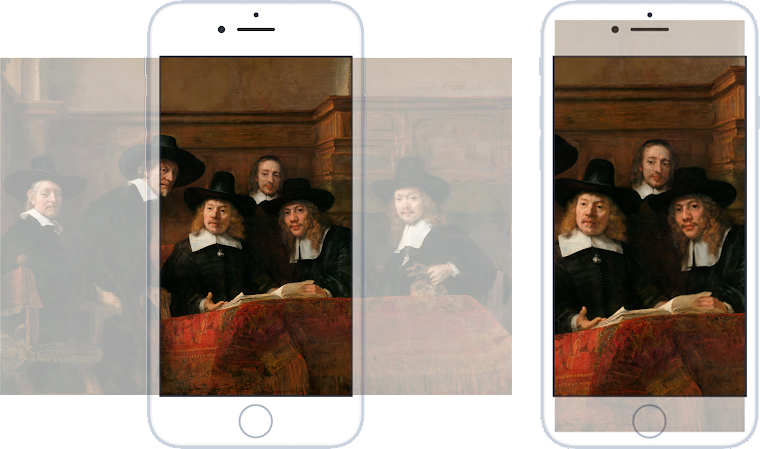
As I mentioned above, the `srcset` and `sizes` attributes are great tools to make your images responsive. This is fine for the majority of websites. Most images only scale to smaller resolutions on smaller screens, and media queries changing the layout of the website often also work with screen widths. However, when developing the new Rijksmuseum website we quickly discovered that `srcset` could not make our images fully responsive. The Rijksmuseum website is completely based around fullscreen images (which made it extra important to optimize them). This means the size of the shown image depends on both width and height. When only using a naive `srcset` setup to make those images responsive, two different problems occur.
Problem 1: blurry/low-res images
Let’s say you want to fill the whole screen with an image and you use `object-fit: cover` or a similar technique to make sure your image fills the whole screen without being warped. If you then leave out the `sizes` attribute, or set it to `100vw`, and the image has a wider aspect ratio than the screen, the browser will download an image that is too small for the screen it is displayed on:
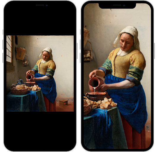
This problem can be solved if you know the aspect ratio of the image when rendering the page, since you can adjust the `sizes` attribute accordingly. For example, this image’s width is about 90% of its height, so our `sizes` attribute can be `90vh` instead of `100vw` (that’s right, you can actually do something with heights in `sizes`, but only to express the width of the image). Then, the downloaded image will always have a sufficient resolution to cover the whole screen. Which brings us to the second problem.
Problem 2: images too big
If an image has a high enough resolution to cover the whole screen without getting blurry, you have another problem: in a lot of cases quite some part of the image will never be visible on screen. This means the user downloads quite some data that is completely useless. To illustrate, let’s take the image from the example of problem 1, but then with a proper `sizes` attribute:

The downloaded image is almost twice as big as the screen to have sufficient resolution to cover the screen.
You would want to serve an image that is cropped to size for each particular screen, so only the visible image data is sent to the user. To do that, we would need to have a solution like `sizes` and `srcset`, but that would also take the height of the screen into account.
Since that is not supported, we need to work around it. Luckily, we can!
HTML5 to the rescue
HTML5’s picture element is actually made for a purpose a bit like this one: serving different images on mobile, with less clutter or with another orientation. You can do that by having different `<source />` elements with media queries which tell the browser which source to use for the device it’s running on. We can use that behavior to serve different crops of the same image to a variety of screens!
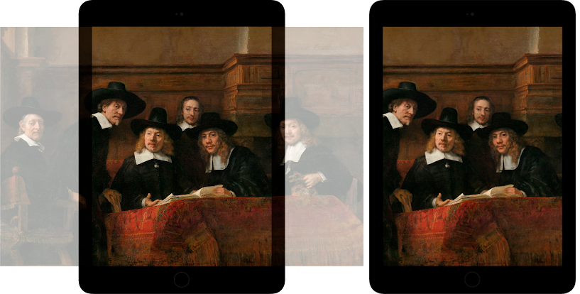
For the Rijksmuseum website, we first dove into our analytics to group our users in ‘aspect ratio groups’; we simply cannot provide a nicely cropped image for every possible screen aspect ratio. This resulted in four groups, from ‘most portrait’ to ‘most landscape’:
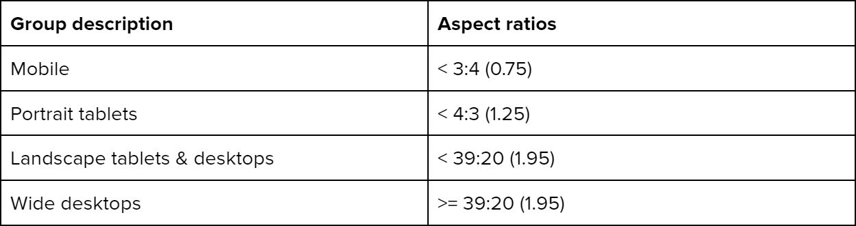
For each group, the lower aspect ratio limit is the aspect ratio the image for that group is cropped to. This makes sure that, since `srcset` will select the image based on width, the image will be big enough to cover the screen when we use a simple `100vw` for the `sizes` attribute.
For all except mobile, that ratio is clear: the upper limit of the previous group (3:4 for portrait tablets, 4:3 for landscape tablets & desktops, 39:20 for wide desktops). For the ‘mobile’ group we looked at the tallest phones that were commonly used to visit the website. This resulted in an aspect ratio of ~28:13, the aspect ratio of the iPhone X.
For each aspect ratio group we determined some key resolutions we should offer images at, based on which devices were most used within each group.
Now, for each fullscreen image, we generate a `<picture>` tag with 4 `<source>` elements, one for each group. Each of those sources has a `srcset` with the image sizes we determined earlier. This looks like the following:
<picture>
<source
media="(max-aspect-ratio: 3/4)"
sizes="100vw"
srcset="[url] 640w, [url] 760w, [url] 830w" />
<source
media="(max-aspect-ratio: 4/3)"
sizes="100vw"
srcset="[url] 770w, [url] 1440w" />
<source
media="(max-aspect-ratio: 39/20)"
sizes="100vw"
srcset="[url] 1024w, [url] 1440w, [url] 2048w, [url] 2880w" />
<source
sizes="100vw"
srcset="[url] 1440w, [url] 1920w, [url] 2880w" />
<img
alt="[description]"
src="[fallback url]" />
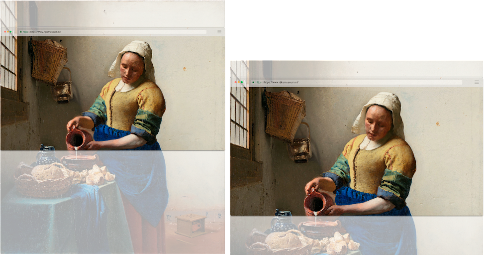
</picture>Let’s compare what images would be downloaded for different popular devices with a naive `srcset` setup (left), and with this setup (right):
It would be really nice if `srcset` and `sizes` would support heights, which is already proposed here: https://github.com/whatwg/html/issues/2973. It would make it much easier to accomplish these same results without all the separate `<source/>` elements.
Size matters. So does the format
Next to your images being responsive, you should look into modern image formats, which are more efficient in compressing images than JPEG. Smaller images that look the same: an easy win!
As of september 2020, Safari finally started supporting WebP. This means that all major modern browsers currently support it, and you’ll do a lot of your users a favor by serving WebP versions of your images. Katie Hempenius wrote a nice article about implementing WebP over on web.dev. Next up is AVIF, which is even (way) more efficient than WebP, so you want it! At the time of writing though, only Chrome, Firefox and Opera added AVIF support it. Hopefully it’s just a matter of time before other browsers have support, so keep an eye on this. If you have a lot of Chrome users, you might already want to serve AVIF images on your website.
For the Rijksmuseum website, we realized a 50-70% savings in total data transferred to the user on some pages by applying the more complex technique described above, and by serving WEBP images next to JPEG.
Do you also like giving your users an impactful web experience? Then please do check our job vacancies (in Dutch) at https://werkenbij.q42.nl!