Revolutionising the way art collections are presented and experienced online
Creating a new digital cultural heritage experience with Oculi Mundi

Creating a engaging and robust way to present an art collection online can be challenging. Every museum with an online presence knows this. The experience must be usable, performant, accessible, and stand out from the rest. A physical representation of the collection provides grounding and recognition. But what if there is no physical representation yet? And what if it shouldn't look like your ordinary website?
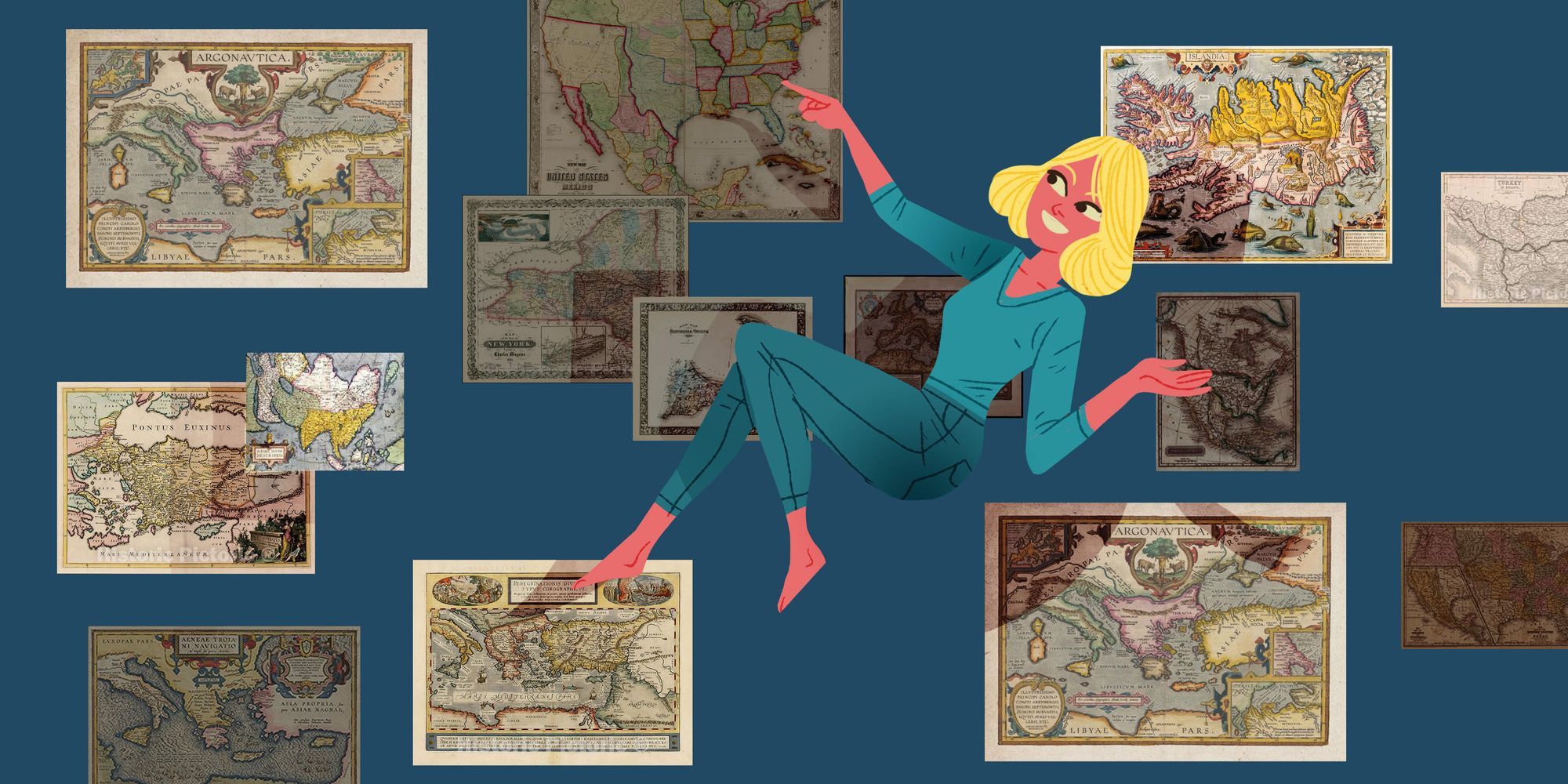
At tech agency Q42, we were most excited to take on this challenge for one of our latest projects, Oculi Mundi. Together with design partner Fabrique, we built an interactive and immersive web experience to showcase The Sunderland Collection: an extraordinary private collection of antique world maps, celestial maps, atlases, and books of knowledge, dating from c.1200 to the early 19th century. With this project, we pushed the limits of design patterns, innovation, and technology to create an highly immersive and engaging experience on the web. Oculi Mundi aims to offer a new perspective on how maps and atlases can be displayed and interacted with online.
This project presented major challenges for us in the areas of 3D experiences and animations, creativity and innovation, performance, and accessibility. But nothing that a group of dedicated nerds cannot overcome! Are you curious about how we accomplished it? Let me talk you through it.
WebGL vs. CSS
The website is designed to provide users with the sensation of floating through space and exploring items as if they were in their surroundings. However, this presented a challenge in terms of accessibility, as 3D rendering technologies such as WebGL work with canvases separate from native HTML elements. While WebGL offers impressive rendering performance, it lacks elements to interact with besides the canvas, making it unusable for people with screen readers. To mitigate this, we would need to render HTML elements alongside 3D rendered elements and keep them in sync. This would not only double the amount of work but also make updates extremely complex. To ensure accessibility without sacrificing the desired experience, we chose to steer clear of these rendering options and rely on the trusty powers of CSS.
Performance could also cause problems. Normally WebGL is pretty performant on devices with a strong GPU, as it tends to use the graphics card for it’s calculations. But lower-end devices might have some trouble rendering a heavy WegGL site. Browser engines, on the other hand, have optimised a lot of the internal calculations needed to render CSS. Creating 3D spaces with the transform property will happen in the visual formatting model of CSS, only applying the effects visually and not on the actual site layout. This makes it a lot more performant to do (re)calculations, as changes in the transform won’t trigger re-layouts of the website.
Besides the calculations, the objects we want to render from the collection are high-end maps. Beautiful pieces of art that people like to take a closer look at. When trying to do this in WebGL, we would need to use extremely high definition textures of those maps to ensure the quality of the images. This would have had an immense negative impact on the performance. With CSS the image files can be a lot smaller, making CSS a better suite as well.
Innovation
Another major challenge we faced during this project was dealing with its distinctive presentation. Not in terms of people avoiding new ideas, but rather in terms of making our user interface understandable to a diverse target audience. At Q42, we always try to stay up-to-date and love experimenting with new technologies. But the power of the internet's accessibility and size means that anyone with a device and an internet connection can visit your website. While this is a beautiful thing, it comes at a cost.
As developers and designers, we tend to generate repeatable patterns that are easily recognised by our users. Therefore they can quickly understand how to interact with the user interface. However, our main task in this project is to create something entirely different. This approach comes with its own caveats. When deviating from what is already known, we are unable to proactively respond to design patterns and trends. Our users are not familiar with how to interact with the product as everything looks new to them. This made us look for new ways of interaction and test them thoroughly.
Younger audiences have an easier time navigating new devices and operating systems, as they are used to the frequent release of new technology. However, not everyone is as adaptable. New technology can cause stress and confusion, leading to frustration if not handled correctly.
To address this issue, we conducted usability tests during our Real User Mornings (RUMs). These usability tests provided insights into our interaction design. While we still have a few improvements in mind for the future, we were able to address some of these insights already.
One of these improvements is the introduction of a custom cursor. The cursor provides hints for certain interactions to create familiarity throughout the website. For example, when the user hovers over an item, the cursor grows in size. If the item is a link that leads to another "space", the cursor grows in size and displays a plus sign.
In addition to these visual hints, the cursor can contain textual hints, such as instructions to drag or scroll to interact with the webpage. These hints are necessary as the website's look and feel becomes almost like a virtual reality, causing users to forget how they typically interact with websites.
Enhancing User Experience
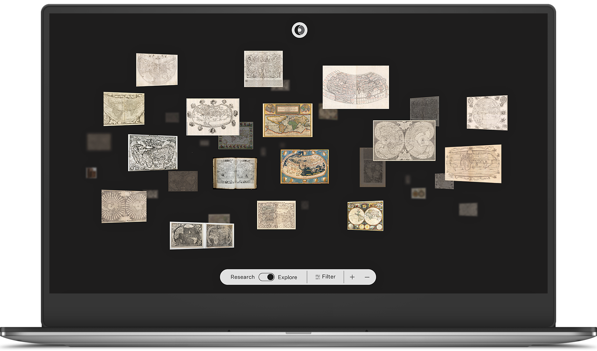
The transformations and 3D effects in our interface are visually stunning, and we have received positive feedback from many users. However, not all users prefer this type of interface. Some users in our audience are researchers who need to find specific maps and collect as much information about them as possible.
To accommodate these users, we built a research mode into the website. This mode offers the same information as the explore mode but presents it in a different way. While the explore mode immerses users into the world of Oculi Mundi, the research mode provides more information on one screen and includes features such as sorting. It also displays the collection in a more familiar grid layout.
Although implementing the research mode was a good idea, it felt strange to start building it in the second phase. It sometimes caused synchronisation problems, as we had to keep track of which version of the website the user was on.
Since the goals of the explore mode and the research mode differ so much, we ended up having pages that exist in one mode but not in the other. This ended up becoming a problem, as we had to keep track of the current mode through the whole website. Initially, we considered using React's Context API to tackle the synchronisation problem. However, we realised this wouldn't work when sharing links or revisiting pages through the browser history. To address this issue, we wrote a hook that sets the page mode in a React Context and includes it in the URL as well.
import { createContext, useContext } from 'react';
import { useRouter } from 'next/router';

export type ViewingMode = 'research' | 'explore';

export function useViewingMode(): [sessionValue: ViewingMode, setSessionValue: (value: ViewingMode) => void] {
  const viewingModeContext = useContext(ViewingModeContext);
  const router = useRouter();

  const setViewingMode = (value: ViewingMode) => {
    viewingModeContext?.setViewingMode(value);

    if (router.query.viewingMode !== value) {
      router.replace({ query: { ...router.query, viewingMode: value } }, undefined, { shallow: true });
    }
  };

  return [viewingModeContext.viewingMode ?? 'explore', setViewingMode];
}

export interface ViewingModeContextValue {
  viewingMode?: ViewingMode;
  setViewingMode: (value: ViewingMode) => void;
}

export const ViewingModeContext = createContext<ViewingModeContextValue>({
  viewingMode: undefined,
  setViewingMode: () => {},
});
Although it may not look as great due to the presence of query parameters in the URLs, this solution effectively addresses all the use cases and edge cases of our problems. It also provides the flexibility to add the page mode option to new pages as the hook is easy to implement in other environments.
Performance
Working with 3D transforms can also cause performance issues, especially when combining multiple transforms with high-resolution images. Our 3D version of the collection, called the cluster, is a perfect example of this. We made sure to use the transform and perspective properties to minimize changes to the layout of the DOM, limiting the use of properties like preserve-3d, 3d-transform, and transition, which can impact performance.
We also memoized states and functions to ensure that CPU intensive functions only run if the desired attributes have changed. Functions that trigger animations use requestAnimationFrame to ensure that the animation is called before the browser repaints.
These performance tweaks helped a lot, but the cluster still causes some CPU overhead. To address this problem, we plan to move away from React for these components and work with simple Typescript classes. We will also decrement the perspective values in CSS, to reduce the transform values and save on calculations.
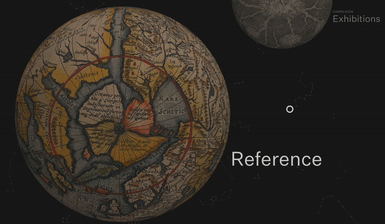
Other examples of these performance issues can be found on the reference pages. These pages contain lists of people who are involved in creating the maps of the collection or glossary terms. These lists of cards seem to float in space over a 3D globe towards the user.
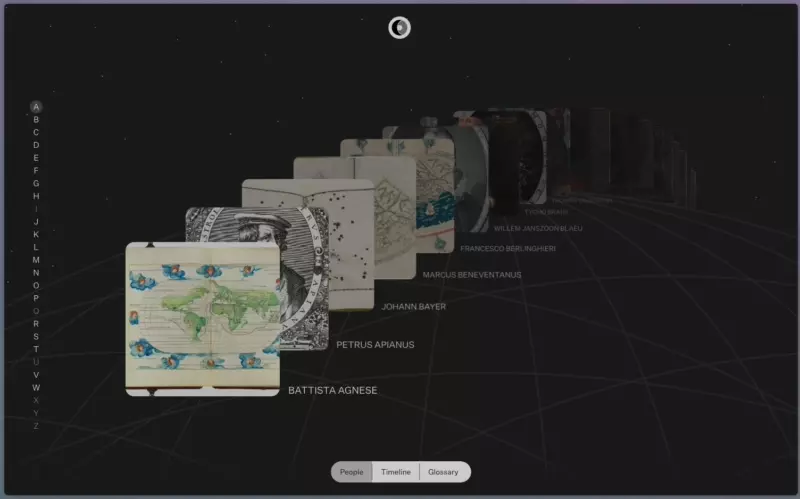
This means that we are transforming multiple properties simultaneously. We are changing the opacity of the cards and text to create the illusion that the items are further away from the camera. Opacity is not a problem, as it can be updated on the visual model just like the transform property. Additionally, we are moving the cards over the z-axis. However, this animation requires the use of the preserve-3d, perspective, and transition properties, which we tried to avoid in the cluster.
The background is also moving when the user scrolls through the list. We could move the background using transforms, but we have found a more performant way to achieve this effect. We made the background a repeating pattern that is much larger than the list. By fixing the globe and the cards, we were able to keep the background "static". We also gave the page a large height value so that it scrolls like any other webpage. This creates a 3D-like effect without any impact on performance.
We received low scores in Web Vital tests for the aforementioned pages due to the long load times for their Largest Contentful Paints (LCPs). For instance, it took four seconds for the cluster page to render the LCP. This was expected, however, since every image on the cluster is rendered in a 3D space, and every collection item is above the fold on the visual layout model. As a result, many images are eagerly loaded. On top of that, they are all high-resolution images, as they become larger as you scroll through the cluster.
Thankfully, this issue was easily fixed. LCP is mainly about the perceived loading speed of the page. By loading in small versions of the images first, we created a blurry placeholder. Then, when the high-resolution version finished loading, we replaced the placeholder with it, which greatly improved the perceived performance.
🇳🇱 👋 Hey Dutchies!
Even tussendoor... we zoeken nieuwe Q'ers!
Accessibility
But enough of all this technical talk! Let's get to the root of things, or rather, who we build things for. As previously mentioned, Oculi Mundi's audience is everyone, and as such, it needs to work for everyone. This is why accessibility is something that kept us up at night.
Due to the platform being predominantly visual, Oculi Mundi sometimes lacks textual content. This makes it enjoyable for users without disabilities, but for visually impaired users, it can be much less so. Accessibility was a huge challenge for us, and we kept it in mind from the moment we started this project. We pushed ourselves to use native HTML elements wherever possible, as this greatly impacts the user experience of screen reader users. Accessibility is already baked into these components, and screen readers know what the elements mean and do, creating a strong symbiosis with them. Shortcuts that screen reader users are familiar with automatically work, updated content is announced, and focus is taken care of where needed. Best of all, you don't really have to do anything for it.
However, sometimes we couldn't use native HTML elements for components. In these rare cases, we sought out some ARIA attributes to complement our case and implemented the right functionality. For example, our information modals. We couldn't seem to get the native modal element working, so we decided to create our own. The big challenge of modals is focus. You want to trap it inside the modal so the user won't be able to interact with elements outside of view. We used a package called react-focus-trap, but it too had its caveats. With the package, you are not able to tab or click on items outside of the children of your <FocusTrap> provider component.
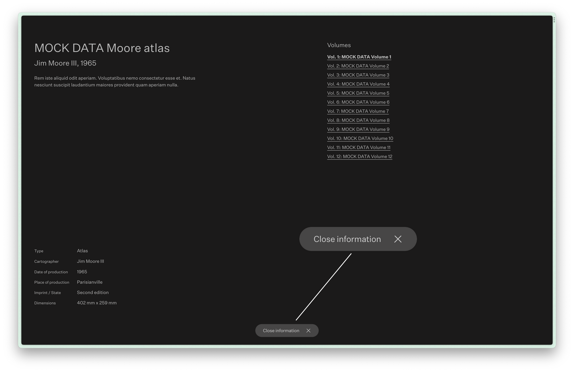
Oculi Mundi uses a custom navigation we called the Dynamic Island, which contains certain call-to-action buttons. One of the call-to-actions, when the modal is opened, is to close it. However, the Dynamic Island is not tab-able as it is a global component living outside of the focus trap. To address this caveat, we decided to have an invisible close button inside the modal that is positioned at the exact same spot and does the same thing as the button in the island.
Why, you ask? Because this makes it possible to use the Tab key, to get to the close button and show its focus as if it was on the button in the island. This is important because not every screenreader user is blind. Most of them can see, and they'll notice if a focus ring is missing. It might sound like a hacky solution, and it kind of is, but sometimes it takes bold and out-of-the-box thinking to increase accessibility.
The website is also full of motion and animations, are completely unusable for people with motion sickness. Luckily, CSS was on our side. With the media query reduced-motion, we could listen to the user's preference and disable all the animations that used some sort of motion or transition. Where we could, we replaced them with a simple fade, as these types of animations typically won't have a negative effect on people with motion sickness but still provide more flair than the hard flashes of immediate content changes.
Conclusion
My main takeaway from this project is that it is possible to create a comparable online experience to that of a real museum, even without a physical space. Of course, when you dare to implement the extraordinary, there are likely to be few obstacles holding you back from unleashing your creativity. But by utilising 3D spacing, we can immerse users and make them feel like they are actually surrounded by the collection.
This project showcases the limitless potential of web experiences, combining innovation, accessibility, and captivating design. With each challenge we faced, we pushed the boundaries of what is possible and created a truly immersive journey for users. The world of online collections will never be the same again.
Do you also like technical challenges? Check our job vacancies (in Dutch) at werkenbij.q42.nl!