Making the internet a little more accessible
Things we learned building the accessibility-first website Appt.org that you can apply to your own projects


1. Appt.org
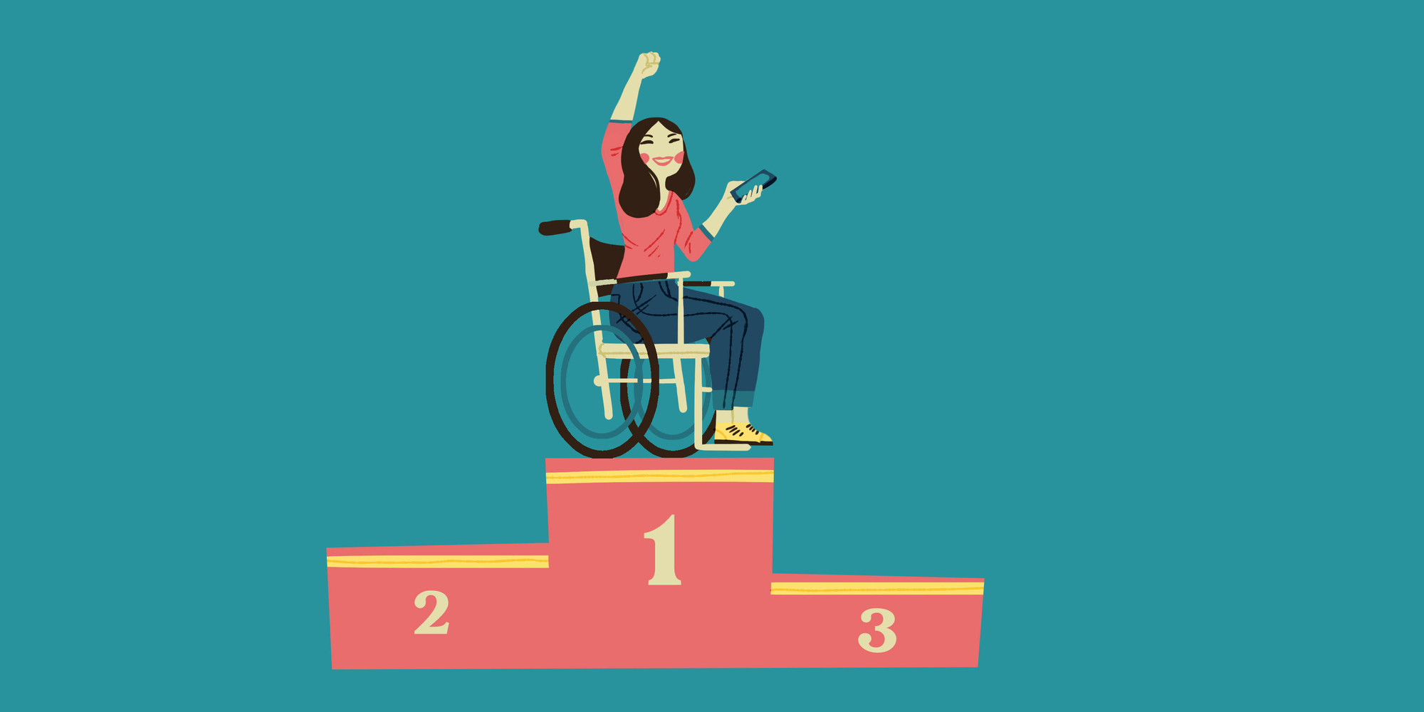
In an increasingly digital world, accessibility is becoming more and more important. After all, everyone should be able to participate in society. This means that apps and websites have to be accessible for everyone, including people with a disability.
In our effort to help make the internet a little more accessible, together with Foundation Appt we launched Appt.org earlier this year. Appt.org empowers developers and organizations to build accessible apps for everyone.
The new website offers current statistics about the use of accessibility features on mobile phones, code documentation for iOS, Android and other platforms, official guidelines, in-depth articles and tips. It’s a one-stop shop for developers that want to improve the usability of their app.
2. Doing things the right way from the start
With Appt.org being an accessibility-first project, we had to do things the right way from the start. It taught us that setting up a solid foundation for crucial accessibility aspects actually saves a lot of time. So much in fact, that throughout the project we got a lot of what makes a website accessible for free. This revelation was very satisfying and too valuable not to share. In this post we will walk you through our learnings from our development process and setup. We feel this might help you in making your own project accessible and convince your team and/or stakeholders to prioritize it.
3. Development process and setup
When building a new website or any application from scratch, we have noticed that the proper mindset is crucial. Building with accessibility in mind and setting things up the right way from the start is half the work. This mindset is not only applicable during development but should also be present from the concept and design to the QA and release phase. You might be wondering how to put this mindset into practice. Don't worry, we've got you covered! We will elaborate on the tools we used and the learnings we gained from Appt so that you can apply them to your projects as well.
Consider native over custom elements
Firstly, it is essential to be cautious about any custom interaction that is introduced in the concept and design of your project. Deviating from established patterns and existing HTML elements will be far more challenging in terms of making those accessible. For example, the default HTML select element is already entirely accessible out-of-the-box on all browsers and devices. Of course, this does not mean that you cannot build a custom dropdown or modal when it adds a lot of value to your project. Still, you should consider that it will require more effort to make your custom element accessible, and it should be an informed choice. This heavily depends on what type of project you are working on and how much time you have. If you want to create an accessible website in projects on a tighter schedule, it is often wise to rely on built-in components.
Lighthouse
There are tools available to ensure that you take accessibility best practices into account in your project and to remind the team. One such tool is Lighthouse from Google, which performs automated accessibility testing. It provides a score from 1 to 100 and detailed information on how to fix possible issues.
Lighthouse can be something you run while developing a feature as a checkbox in the definition of done of a pull request. However, it can also be integrated into your CI/CD to prevent merging new features with detected accessibility issues. The latter is less error-prone but requires more setup. The most important thing is to remind each other in reviews and ensure that at least the automated tests succeed.
💡 If you want to know how to create a Lighthouse Plugin and add it to Lighthouse CI in GitHub Actions, check out this blog post by our colleague Roelf-Jan.
Test accessibility in acceptance
Automated test tools like Axe DevTools cover a significant part of what makes a website accessible. However, we have learned over the years that while WCAG guidelines and automated tools are helpful, they do not guarantee an accessible experience for your end-users. This requires additional manual testing.
While building Appt.org, we had the benefit of a product owner with a lot of experience testing accessibility. We leveraged this knowledge in an acceptance step in our process and definition of done. Before we considered a feature done, it was tested for its functionality, requirements, and accessibility. You might already have an acceptance or QA step in your development process, so we encourage you to incorporate accessibility into it as well.
4. Examples
So, how can you make accessibility a higher priority in your project and how can you work on it while developing? To make a good start you need to think about it in the design stage of the project. There are some core concepts to keep in mind, and when you do this more often it won’t take up much extra time. Things to keep in mind are: colour contrast, the use of HTML tags, scalability and making sure all the users have the same information.
Below, we give you some examples about how and what we did in the Appt project.
🇳🇱 👋 Hey Dutchies!
Even tussendoor... we zoeken nieuwe Q'ers!
Dark Mode
We wanted to support dark mode for users that have trouble looking at light backgrounds and the other way around. Before starting building the website we took some time with the designer to map out our colours, for each colour in light mode there was a matching colour in dark mode.
As a CSS framework we used Tailwind in our project, so we set up our colour system in Tailwind and tested it in some components to see how it worked. We created a naming system to determine what colours should be used for. In our Tailwind config we defined the colours:
colors: {
    transparent: 'transparent',
    current: 'currentColor',
    accent: withOpacityValue('--color-accent'),
    'accent-hover': withOpacityValue('--color-accent-hover'),
    onaccent: withOpacityValue('--color-onaccent'),
    surface: withOpacityValue('--color-surface'),
    onsurface: withOpacityValue('--color-onsurface'),
    body: withOpacityValue('--color-body'),
    placeholder: withOpacityValue('--color-placeholder'),
    background: withOpacityValue('--color-background'),
},
We use CSS variables to create colour variables that change based on the theme selected by the user. We defined our variables in CSS like this:
/* Light theme */
:root {
    --color-accent: 204 0 185; /* #CC00B9 */
    --color-accent-hover: 184 0 166; /* #b800a6 */
    --color-onaccent: 255 255 255; /* #FFFFFF */
    --color-surface: 255 255 255; /* #FFFFFF */
    --color-onsurface: 245 245 245; /* #F5F5F5 */
    --color-body: 0 0 0; /* #000000 */
    --color-placeholder: 148 148 148; /* #949494 */
    --color-background: 245 245 245; /* #F5F5F5 */
}

/* Dark theme */
html.dark {
    --color-accent: 249 103 233; /* #F967E9 */
    --color-accent-hover: 248 69 228; /* #f845e4 */
    --color-onaccent: 0 0 0; /* #000000 */
    --color-surface: 38 38 38; /* #202020 */
    --color-onsurface: 28 28 28; /* #323232 */
    --color-body: 255 255 255; /* #FFFFFF */
    --color-placeholder: 148 148 148; /* #949494 */
    --color-background: 28 28 28; /* #323232 */
}
This only took us a little extra time to set up, resulting in a much faster development experience later. We can now just use our colour variables in any component and it will automatically choose the correct colour in dark and light mode. Nothing more than a quick look to see if everything looks okay; and we can build new components in light and dark mode without even thinking about it or needing design.
Text scaling
To make sure people that use a larger text size on their device can still read our website properly by scaling the text to support their chosen text size, we also made some choices from the beginning that enabled us to build without having to worry too much about text scaling. We did this by using REM’s. REM is a unit relative to the root element. We recommend avoiding setting a font-size on the :root, html or body elements. By setting a font-size on these elements you override the default browser size and thereby also the default size set by the user. This is something you don’t want to do if you want your text to scale based on the user settings. We didn’t set a root font-size and used REM’s for all other elements to set the font size.
In our Tailwind config we set up everything we want to use REM’s for: font-sizes and media queries. We use REM’s for media queries because they will scale with the font too. If the user selects a very large font the viewport will go to mobile view for example: this way the user will have more space for the text.
screens: {
    xs: rem(460),
    sm: rem(640),
    md: rem(768),
    lg: rem(1024),
    xl: rem(1280),
    '2xl': rem(1536),
    // Mobile-first styling is preferred, but as a last option we might resort to max-width breakpoints
    'max-lg': { max: rem(1023) },
    'max-2xl': { max: rem(1535) },
}
// Converts pixels to rem units, 1px equals 0.0625 rem
function rem(px) {
return `${0.0625 * px}rem`;
}All line heights are set relative to the font sizes:
fontSize: {
    'heading-xxl': rem(112),
    'heading-xl': rem(64),
    'heading-l': rem(32),
    'heading-m': rem(24),
    'heading-s': rem(20),
    'heading-xs': rem(16),
    paragraph: rem(16),
    'paragraph-intro': rem(16),
    'paragraph-s': rem(12),
    'menu-item': rem(16),
    'input-label': rem(16),
    quote: rem(24),
    'mobile-heading-xl': rem(44),
},
lineHeight: {
    'heading-xxl': '1',
    'heading-xl': '1.25',
    'heading-l': '1',
    'heading-m': '1',
    'heading-s': '1.2',
    'heading-xs': '1',
    paragraph: '2',
    'paragraph-intro': '2',
    'paragraph-s': '2',
    'menu-item': '1',
    'input-label': '1',
    quote: '1.33',
},
Now we can use these variables throughout the code and our website will be fully scalable without any extra work.
HTML structure
Another thing that is important for multiple reasons, but also accessibility, is the HTML structure. By setting up a correct structure, meaning using headings in the right order, using native HTML elements where possible, using lists for listed information and so on, it’s much easier for a user using a screen reader to scan the content. Screen readers have shortcuts for multiple things like giving a quick overview of all the headings in a page. Setting up a correct structure helps the user navigate your content. There are also built-in keyboard shortcuts and navigation options for native HTML elements. For example, when something is a button and you use the button element you get things like keyboard focus, tabs, and clicks (return key) for free. You have to create HTML elements anyway, so using the correct ones doesn’t take up more time and it fixes the biggest part of the accessibility of the website for you.
💡 Is using a native element not an option? You might want to take a look into headless component libraries like Headless UI or Radix UI.
Aria attributes
If you implemented the correct colour contrasts, text scaling and correct HTML structure you covered the biggest part of creating an accessible website. By using ARIA attributes in your HTML you can add that last layer of accessibility. Let us give a few examples:
Label your content
With an aria label you can label an interactive element, for example when you have icon buttons you want to tell the screen reader user what type of button it is.
<button aria-label=”Play video”><svg>[Play icon]</svg></button>Guide the user through expanding content
When you have expanding content, for example FAQ sections, you want to help the user by telling them what is happening on the screen.
<button aria-expanded=”false” aria-controls=”answer-1”>
	Question
</button>
<p id=”answer-1”>
	Answer
</p>
With the aria-expanded attribute you can tell the screen reader user if the content is expanded or not. With the aria-controls attribute you can tell the user which piece of content you will be expanding. By adding this information you make sure the screen reader user has the same information as the users that see what’s happening on the screen.
You can check the W3C ARIA design patterns for more examples on how to make components accessible: https://w3.org/WAI/ARIA/apg/patterns.
5. Learnings
To recap, some tips to make your website more accessible from the start:
- Consider using native HTML elements over custom ones for better. accessibility, unless a custom element adds significant value to the project.
- Use automated accessibility testing tools like Lighthouse to ensure accessibility best practices are being followed and to catch potential issues.
- Incorporate accessibility testing in acceptance or QA to ensure that the user experience is accessible, even beyond automated testing.
- Create a colour mapping with the designer for themes like darkmode, this way you can set up new features fast without needing to design for every theme.
- Use REM’s for text and media queries, so your site scales with the default text size your user has selecte.
- Use the correct HTML tags and structure, so it’s easy to navigate your site with keyboard and screen reader.
- Add aria attributes to make sure the screen reader user has the same information as the user gets when looking at your website.
Do you also like to go the extra mile to make apps and websites more accessible? Then please do check our job vacancies (in Dutch) at https://werkenbij.q42.nl!