Beautiful accessibility with Floating Focus
A package published by Dutch tech agency Q42 to empower the end user, while keeping the designers on your team happy

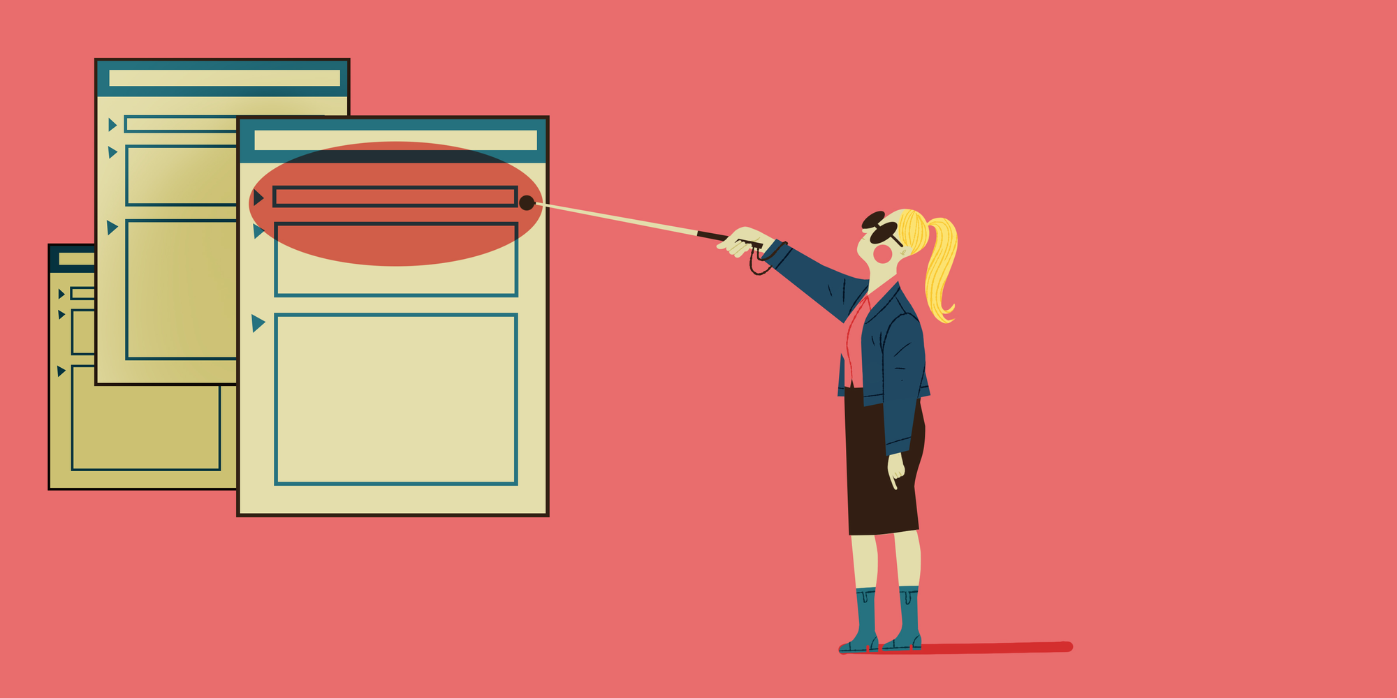
Focus style is one of those hot topics that stirs up a lot of discussion. Ideally, the user should always know which element is focussed at a given time. But in our experience, the browser capabilities often don't align with the designers' wishes.
Often the default outline will be replaced with a different kind of border, with subpar contrast compared to the default solution. This leads to users getting lost when they use a keyboard to navigate a page or form. But who can blame them, or the designers for that matter, when the native outline is so hard to style? And why do mouse users get to see the outline by default when clicking on a button?
In case you don't know: the native outline CSS property has no border radius when you choose the solid outline style. When you choose the (default) auto outline style, it's up to the browser gods how it will look. On Chrome it has a white ring around it that you can not remove and a fixed border radius. Even when you choose a specific color with the auto style, the ring is still half white. Safari and Firefox both render a translucent orange outline and completely ignore the outline-color property. As an alternative you can abuse border or box-shadow to fake the outline, but they either easily conflict with existing styles or do not allow for an offset.
At Q42 we pride ourselves in doing everything for the end user. That's why we fight for accessible end products. After we encountered the same problem for the umpteenth time, my colleague Ricardo and I set out to either find or build an improved focus state. A focus state that satisfies both designer, developer and most importantly, the user’s needs.
Subject research
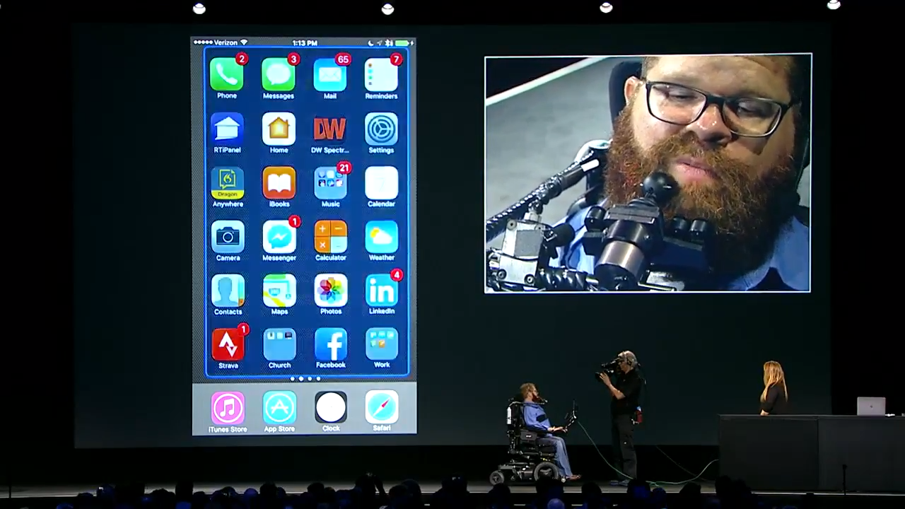
On our search for a better solution, we stumbled upon a keynote video by Apple. It showcases the switch control integration in iOS 11. The outline floats above the interface and moves from targeted area to targeted area. When a selection is made, the background quickly flashes with the outline color. This flash gives the user feedback that the action has been executed. The floating outline felt like the perfect solution to a keyboard focus state. This is what we needed in the browser!
On the web, the open source package Flying Focus was another source of inspiration. It animates the outline from element to element, to smoothly guide the user to the next element. This was a great start, but unfortunately still worked with the native outline.
Another option we considered was the popular What Input, which helps to decide what the input intention of the user is. This allows you to style your focus differently when a user uses a mouse versus when a user uses a keyboard to navigate through the site. This is nice, except that it also still works with the existing focus state. So there's still a need to manually style with outline, border and/or box-shadow.
So, what about the browser native focus-visible? It works similarly to what-input. But it's only really supported since version 86 of Chromium based browsers. Firefox has a non-standard implementation under :moz-focusring. Safari and Samsung Internet show no signs, while they're responsible for over 10% of global internet traffic. We think we can do better. (source)
We were surprised to find out that there were no libraries that suited our needs to create an outline. So, we decided to combine the inspirations mentioned above into a single, easy to use library.
World, meet Floating Focus
After this exploration we had a good idea of what a good focus state needed. It needs to have a high contrast but not impair readability of the underlying components. It has to guide the user to the next focus target with a form of transition. And it only needs to show for users benefitting from the focus outline. Let's also not forget that the package needs to be very developer friendly and easy to implement.
As mentioned before, the native outline does not satisfy the designers' needs, so by default we're going to get rid of it in CSS with a global focus state selector. Instead, the package will create a new element that will render a border and will move to the appropriate position. You can consider this element to be an overlay on top of the existing page. This overlay is given a fixed position on top of other elements.
The script basically has five stages during its operation:
- Determine if the Floating Focus should be enabled: i.e. mouse vs keyboard input.
- Find the focused element position.
- Calculate the required styles: width, height and border-radius.
- Interpret and convert the outline values: color, style, width and offset.
- Smoothly transition the overlay to the styles from steps 2, 3 and 4.
In stage two, we find the new center position of the element that we should transition to. The duration and easing of the transition are all customizable through CSS, just like all other settings for the Floating Focus package. In the third stage, we try to match the focused element as closely as possible. This means that by default the Floating Focus element will copy the border-radius and exact width and height.
The fourth stage allows for some customization per element. For example, maybe you want some extra offset around an element, or want the focus highlight to be blue instead of red on specific buttons to allow for more contrast. Floating Focus will smoothly transition to these new colors and offsets. It will even change the border-radius based on the outline-offset value so that it flows more naturally around the focused element. All these settings are changed through CSS, just like you would with normal outlines.
In production
Along the way we found some special edge-cases that we needed to support. We now follow elements in transition, track parent scroll containers and support focusable elements that are hidden from view (i.e. custom styled checkboxes and file inputs).
Now that we've implemented Floating Focus in over ten high-traffic production websites including Staatsloterij, Rijksmuseum, Van Gogh Museum and Philips Hue, we think we’re ready to actively share Floating Focus with the world. The documentation is located on GitHub. Pull requests are very welcome.
🇳🇱 👋 Hey Dutchies!
Even tussendoor... we zoeken nieuwe Q'ers!
Instruction manual
Let’s implement Floating Focus in your project. We think the setup is quite simple. It requires just three straightforward steps to get Floating Focus running in nearly any project.
Install Floating Focus
With npm properly set up for your project, run npm install @q42/floating-focus-a11y from a terminal in the project folder context.
Instantiate the library
In your main JavaScript or TypeScript file, load the library, and run it after page load.
Style the Floating Focus ring through outline styles
First, hide the default focus outline styles for all normal input devices. A focus state should still be present, but it can be more subtle, like a border or background color.
Next, style the Floating Focus outline through the outline css property.
Both the :focus pseudoclass & .focus class are required, so the library can do its magic and support "focus target" delegates. If you're thinking "what the hell is a focus target?", read on.
Focus target delegates
If you have a custom checkbox, chances are that you want to hide the actual input element, and render a more customizable element like a set of spans. To delegate the focus to your custom-made checkbox, you can use the focus-target attribute on the element that would otherwise receive focus.
Floating Focus will now focus the custom checkbox span, instead of the actual input that is hidden or displayed off screen. The focus target behaves just like the for attribute on a label element, and accepts the id of another element as its value.
Styling
By default, the styles that are required to make the Floating Focus package work, will be bundled with the default import. This makes the setup process to use the package quite simple. But this approach has a drawback, the style is injected as a style tag. In some cases a project is set up with a strict style-src Content-Security-Policy header. When a browser detects this header, it will not allow inline style tags on a page. For scenarios like these we have a different entry point:
If you use this entry point, the style should be imported separately:
The style is exported as raw CSS, so you can use whichever CSS preprocessor you like best.
Questions?
By now you will probably have a solid understanding of why you would want to use Floating Focus, and how this can be achieved. If you have any questions, do not hesitate to reach out to me: @guidobouman or guido@q42.nl. We firmly believe every website on this planet should have great accessibility.
Do you also like to go the extra mile to make websites more accessible? Then please do check our job vacancies (in Dutch) at https://werkenbij.q42.nl!