Android Server Driven UI
How we were able to build a native Android app in record time as well as iOS and Web applications, by sharing business logic and UI components.

One code to rule them all
“Finally, a native app!” I shouted while a feeling of relief washed over my face. After all, I had spent the first half of 2018 working with React Native and the experience was far from delightful.
“Yes,” Laurens continued. “It’s native and we will build it based on JSON components coming from the backend”.
My face instantly turned 😱 and, while a sensation of React Native deja-vu overwhelmed me, I could hear in my head “Oh boy, fasten your seatbelt”.
This was the beginning of the journey that would shift my beliefs completely from skeptic to convinced and, finally, to supporter of this 🌈 magic technology.
The promise of the Server Driven UI technology was quite a big challenge:
Build native Android, iOS and Web apps simultaneously while sharing business logic and UI components in record time.
Luckily, the working environment at Q42 encourages us to embrace this kind of challenge and we had just the perfect project for this adventure, Primephonic, a new classical music streaming platform for Android, iOS, and web. (Update: in 2021, Primephonic was bought by Apple. A year later, the app was relaunched as Apple Music Classical.)
My colleague Laurens goes into great detail in his article about what Server Driven UI means for the backend and the multiple client apps, as well as the project’s journey after we adopted this new technology.
In contrast, my article will explore Server Driven UI from Android’s perspective and dive deeper into the platform’s technical details.
💡 Tip: If just want to know if this technology is a good match for your project, feel free to directly jump to the Conclusions section below.
Therapeutic Android development
Reading the promises of Server Driven UI you might think this is just another take on React Native or Flutter. While the goal might be similar, the approach is radically different.
In frameworks like React, you must sacrifice your developer tools, programming language, and even well-known mobile patterns 🚮. However, in Server Driven UI you keep all of those but you get rid of some of the most tedious parts of Android development, like duplicating XMLs, ViewModels or repositories with tiny variations. Each screen is like a snowflake️ made of the same essential components but combined in different ways.
Comparisons aside, Server Driven UI is agnostic from the client framework used, so it can be combined with React Native or Flutter. The key is to understand the simple yet mind-blowing change Server Driven UI brings to the foundations of how we build our Android apps. It all starts with an idea.
A simple idea
We have spent the last 10 years sending just content to our apps. Would it be such a crazy idea to also send the structure of that content to an app?
Let’s start with the three essential pillars to build our app: content, visual structure, and flow. Following the typical architecture of an Android app, the content comes from the backend (in the case of Primephonic this means a REST API returning a JSON with a list of albums) while we define in native code both the structure (e.g. albums are shown above artists on a particular screen) and the interaction flows (e.g. where to go when tapping on an artist).
Now imagine how the app and the JSON work if these three pieces, content, visual structure and control flow, all come from backend in a single JSON tree 🌳 response. Welcome to Server Driven User Interface.
Note in this last snippet how the first section has a type field (with value “album”) to let us map these JSON tree nodes into type-safe Kotlin classes.
Show me the code
In our first conversation, Laurens mentioned components coming from the backend, but what are those components and how do we use them to build an app like this one?
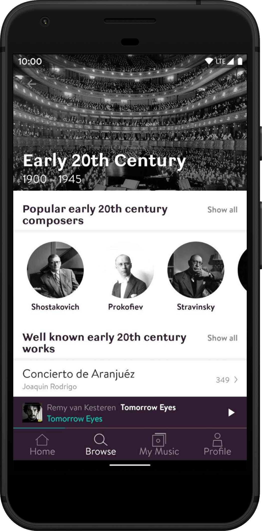
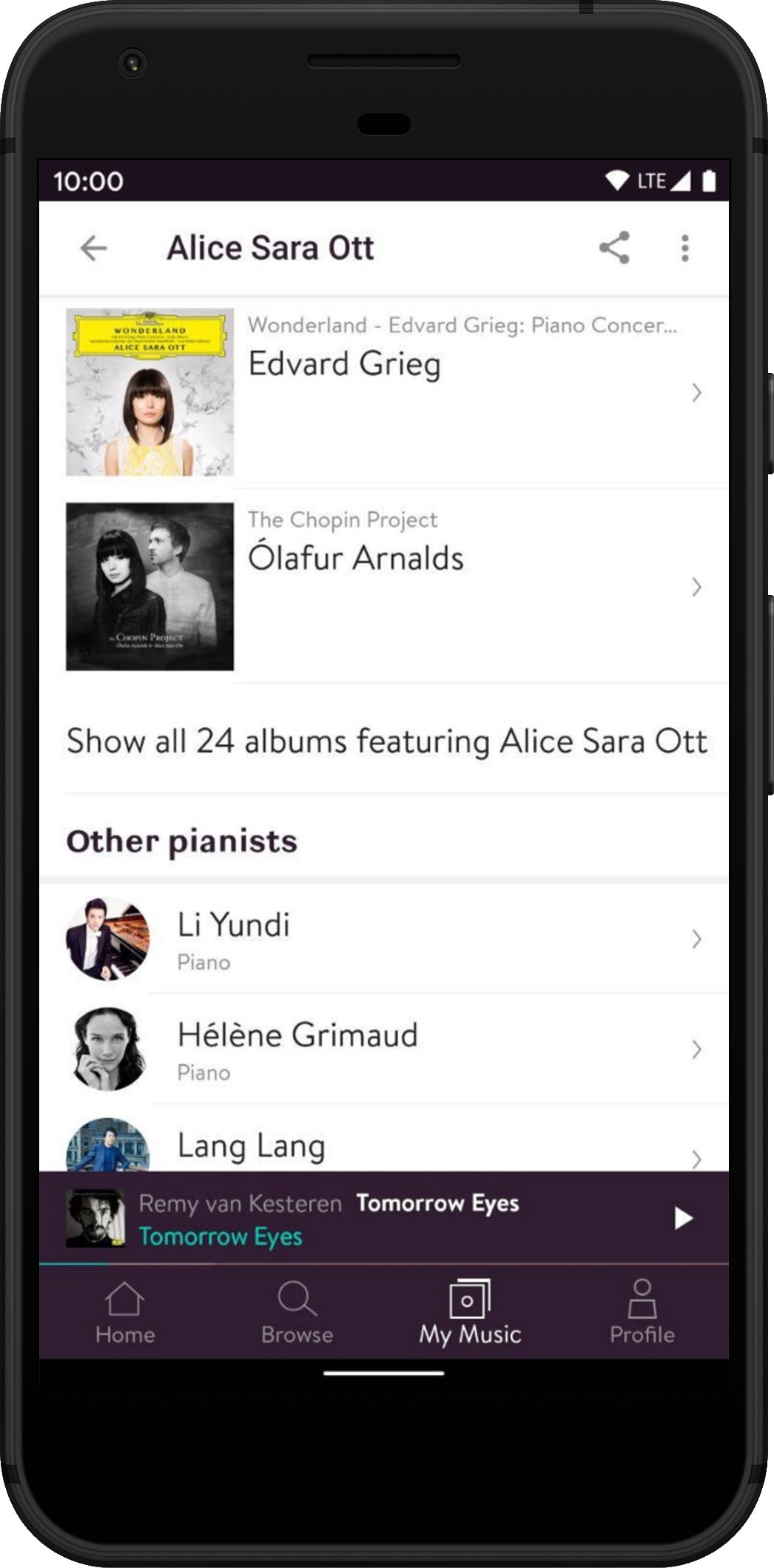
We build these screens following these three logical steps: first, data processing, then apply our business logic and finally render the views. Let’s take a deeper dive.
Data - To build this screen we need to start by mapping the JSON 🌳 structure into a hierarchy of classes. Kotlin sealed classes are a perfect match to build this hierarchy. They will become a lifesaver once we have to build the UI. But let’s not get ahead of ourselves. Here is a simplified example of how we create a type-safe branch of the tree:
The only special concept to build this 🌳 is the polymorphic deserialization 😲 which is just a fancy name for mapping the type field in the JSON response (e.g. “type”=”album”) to a class (e.g. AlbumListItem). You can read more here. In a nutshell, we define a mapping between classes and type-names with a class fallback when no match is found (crucial for backward compatibility).
Logic - Here we follow the standard MVVM structure like most current Android apps. The ViewModel requests the data from the backend, parses and provides it to the UI layers in an observable object: the ViewState. One invaluable benefit is that we write the Data-repository, Use-case, and ViewModel once and we don’t need to think about it again, nor reinvent the wheel implementing small variations of the same code for every new screen and every new feature. 🤯
View - The Fragment/Activity will receive these ViewState snapshots from the ViewModel and call a function to build the UI using the root layout as the container and the ViewState (the UI 🌳 as a ComponentScreen instance).
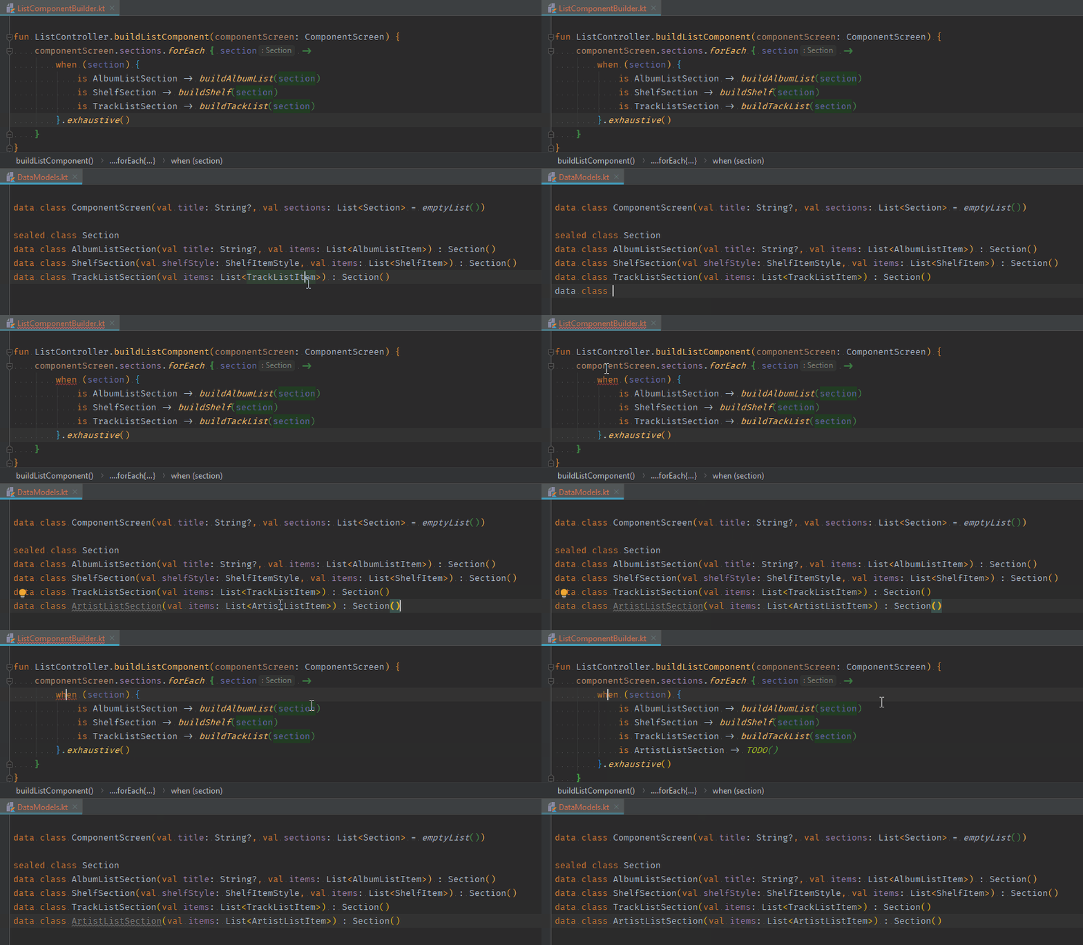
The beautiful simplicity of building UI as we go down the 🌳 of components from the ComponentScreen makes the experience delightful and just fun. Yet, Kotlin makes this even better when we face one generic component like the Section in our example. Kotlin’s exhaustive when expressions will force us to implement all possible versions of the sealed Section class at compile time. This means, when a new type is added to the data model for a new feature, the compiler will tell us exactly all the places in the codebase where we need to implement the UI for the new feature. Just magical.
Part of the simplicity is based on using Epoxy’s RecyclerView-on-steroids to build the UI in a simple and yet very scalable way. Sections with lists of vertical items are flattened into a single vertical RecyclerView and horizontal lists are nested RecyclerViews, all sharing a single pool of recyclable views. Building a screen with 5 items has the same complexity and performance of a screen with 500 items. Adding new items becomes a no brainer.
Actions and navigation - Our users want to interact with the beautiful UI we have built. For that, the server provides a family of components called Actions. The most basic examples are screen navigation actions:
Implementation is straightforward. This action will be used as a click-listener on the UI item to navigate to a new fragment with the given “url”. The PlayAction will contain the track id required to start the music player and the CommandAction below can handle more involved scenarios like creating a playlist by showing first a dialog prompt to enter the new playlist’s name:
The lost database
Most typical Android apps require a local database (e.g. to save favorite items) that we need to sync with the server to keep the user’s account updated between devices and platforms. Surprisingly, our app supports this synchronization across platforms out of the box without any local database. The magic is the single database in the backend. Since our app sends all actions to the backend, it automatically becomes our single source of truth.
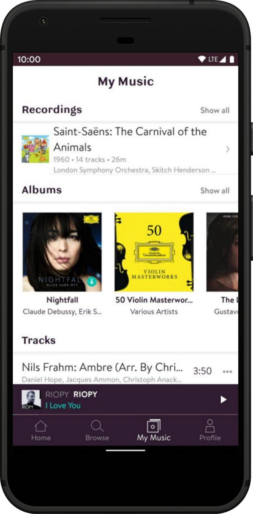
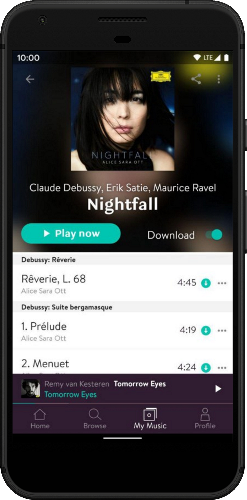
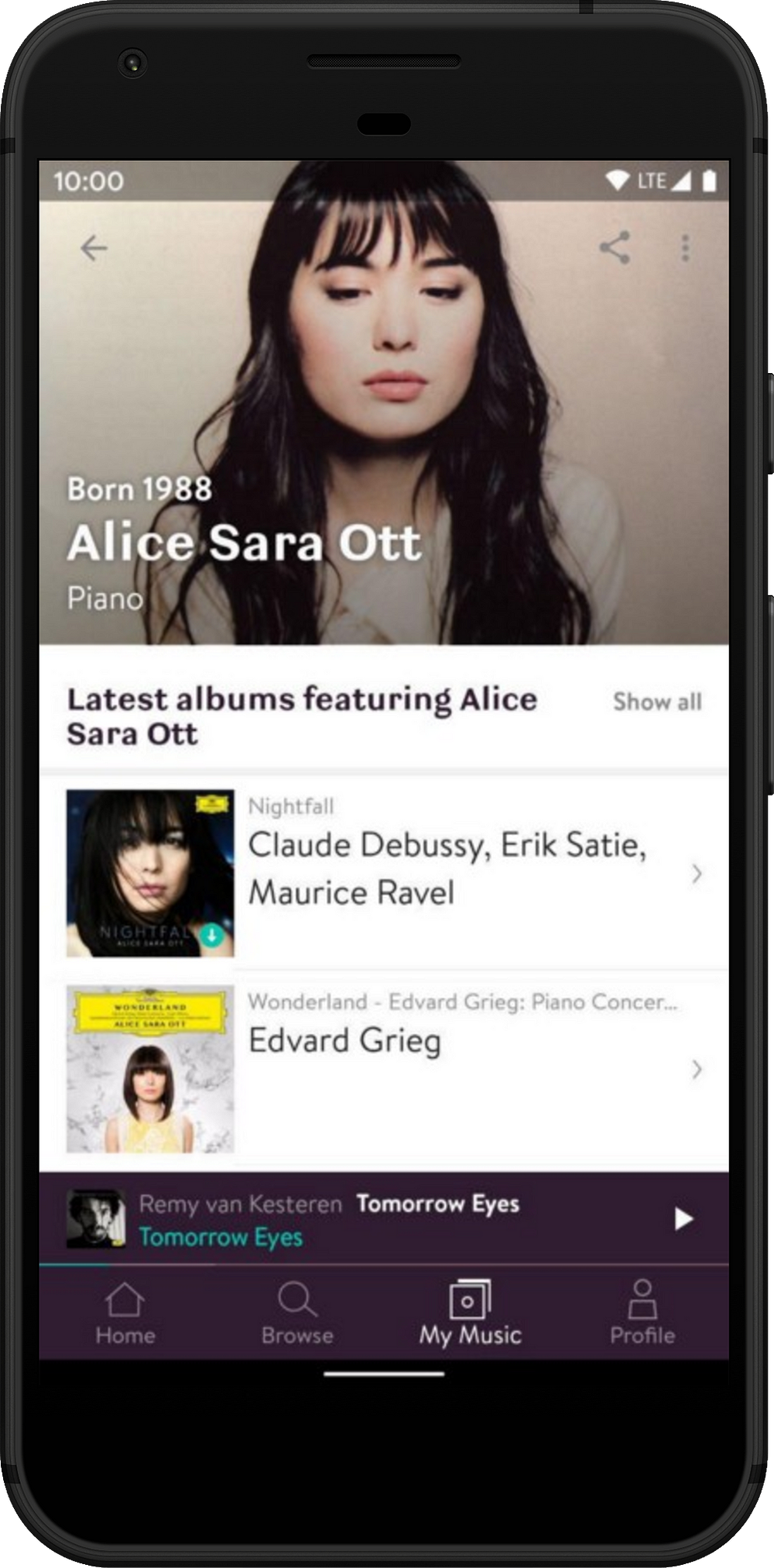
There is one side effect of not having a local database. Actions in one screen (e.g. mark an item as a favorite) do not reflect the updated items across the screens until we refresh them. In practice, this is not a problem for most use cases. For the few cases that need this local sync, we have a simple solution: add a local database with just the minimal information needed to sync between screens (e.g. id, favorited).
After describing Server Driven UI to my colleague Chris, he looked very puzzled and chuckled, “so you are reinventing HTML?”
Infinite possibilities
By now, your brain might be stretching and hurting 🤯 from the neverending stream of possibilities you envision with this framework. Here are a few quick examples:
- A/B testing features and combinations of UI components without releases
- Analytics logged in the backend instead of once per client
- Different styles[2] or layouts[3] in JSON responses based on the client
- Send a flow of screens with conditional navigation in a single JSON response
- Support a completely new platform (SONOS in our case) in just a week 🚀
The silver bullet syndrome
But wait, before you start losing sleep over the infinite possibilities, my advice based on our experience is to build the minimum amount of framework that you need and think about really beneficial use cases before expanding it. It’s important to avoid the over-engineering headaches of applying a cool new technology to all the corners of your codebase, also known as, the silver bullet syndrome.
What about the small print?
There are certain areas of this technology that newcomers consider worrisome, but you should definitely not worry 😎 about these top two:
- Size of JSON responses: the increase in size is mostly irrelevant once you apply gzip and other[4] compression mechanisms.
- Offline access: caching of JSON data is fairly simple to implement.
In contrast, UI components in this framework are pessimistic by default and while we implemented simple solutions to alleviate this shortcoming and make the UI more optimistic, this area is usually underestimated by newcomers.
Finally, the combination of UI data coming from the backend as well as local Android sources (sensors, or libraries like the media player) is slightly more complex than in traditional applications.
Conclusion
The simple initial idea evolved into the best solution to build an incredibly flexible and reusable UI in record time. Let’s break down these conclusions:
Flexible because the backend can make changes without requiring a client app release[5]. Also, new features can be implemented when suitable for the client app schedule and old versions of the app fallback graciously.
Reusable because UI components and action handlers are implemented as self-contained and composable units. As a consequence, they are highly reusable. Besides, new features based on existing components can be completely or partially working without changes on the clients.
Accelerated development because logic is written once in the backend. We stop reinventing the wheel, refactoring and adapting the UI for each new feature on the client apps.
The most difficult question that only you could answer is: will this be a good match for my project?
To help you answer this question I can give you some guidance points about which parts of your app are a good match. Think about screens:
- Where most of the content comes from the backend (e.g. shops) ✔️
- With daily updated content (e.g. news) ✔️
- With lists of mixed item types (e.g. travel routes) ✔️
- With a lot of user interaction with feedback (e.g. drawing, gaming) ❌
- Where the content is purely local (e.g. camera) ❌
- With static or seldom changing content (e.g. profile screen) ❌
If you use some form of this technology, please share it in the comments. I’m still surprised by how many people are playing with these concepts in isolation. We can all benefit from sharing our experiences.
Happy hacking 🖖
Footnotes
[1] Except for the bottom bars (including mini-player) the rest is in JSON.
[2] Styles can be as simple as colors embedded in each component or as complex as a standalone JSON config containing styles for all components.
[3] Layouts are complex and tricky because you need a multiplatform rendering engine like Yogalayout, so you need a good use case for this kind of flexibility.
[4] Instead of JSON, you can use very optimized serialization: Protocol Buffers.
[5] Google: Expect longer Android app review process for unknown developers.

