Discovering Server Driven UI
Our story about how Server Driven UI has contributed to the success of classical music streaming service Primephonic.

How we added a Sonos integration in one week
“It’s done,” Sjoerd casually mentions.
“The proof of concept?” I asked.
“No, everything. I also added search.”
We were blown away. In one week Sjoerd ported an app we built for Web, iOS and Android to Sonos, a new platform for us. We expected he would need at least four weeks. Two key factors made this possible. First of all, Sjoerd is a brilliant developer. Second, and most importantly, the UI of our apps was already server-driven. This is a story about the latter.
What is this Server Driven UI?
To avoid confusion I’ll first share my take on what Server Driven UI (also called Backend Driven UI) means: Server Driven UI moves the responsibilities of what is visible on screen to the server.
Effectively, the server defines which components are part of a screen and their order; these are described in the API. The apps render their native implementation of all the components. This allows the apps to deliver a high quality user experience with all features native to their platform.
Having that out of the way, I can tell you the story about how Server Driven UI contributes to the success of our customer Primephonic. (Update: in 2021, Primephonic was bought by Apple. A year later, the app was relaunched as Apple Music Classical.)
Retract React
Primephonic is a streaming service for classical music. As a startup, Primephonic needed to spend their money wisely. People expect a streaming service to be available on at least on iOS, Android and Web. Our initial hunch was to solve this budget-constrained cross-platform challenge with React. We had built several mobile apps with React Native, and several web apps with React. From this experience it made sense to use React Native for Primephonic’s mobile platforms and share logic and React components with the web player. As we went along we didn’t feel React Native would be the right match.
We felt a premium service like Primephonic should have high quality apps. While our previous React Native apps were good, they were not as silky smooth, not as nimble, and just not as nice as our true native apps. The last time we built an audio player app with React Native, we found that a relative large portion of the code turned out to be native anyway. For instance, code to properly implement high-quality audio streaming, lock screen and support for remote controls on headphones, downloading music to the device and in-app purchases. We had native developers for iOS and Android in our team. Couldn’t we find a way to build these apps completely native but quicker?
Our first steps in this uncharted territory
We had to find a way to cut development time from the native apps and share it across platforms. We were already on the path of writing the core logic and screen layouts in Typescript in the React scenario. What if we just moved that to the server? This seemed like a logical step but after years of REST it felt a bit scary to make such a fundamental paradigm shift.
Sander, resident iOS developer, Bram, the designer, and I, the API developer, started building a prototype. Sitting side by side we would look at the screen designs and polish out minor inconsistencies with Bram. Then Sander and I would mock up the JSON for the screen. In parallel we would each implement either side of the API, going through multiple iterations per day. This rapid iteration process between designer, app developer and API developer together with the new screen-centered API approach really took off. Our prototype quickly solidified into the main product. We were in business!
We were all talking about the same thing: screens
In hindsight, the Server Driven UI approach streamlined team communication in ways we hadn’t foreseen.
Let’s look at how we do things traditionally. In a very simplified view of the REST based world, the designers and app developers discuss user flows and interaction patterns. Then the app developers and backend developers discuss the required data coming from the REST endpoints. Designers and backend developers typically don’t get into heated debates about design or technical tradeoffs.
Now compare that to the new approach. Team communication is mostly based on screens. The backend developers base the design of the API directly on the visual and interaction designs. This sparked a lot of discussion between the backend developers and the designer. This always led to an improved overall understanding and better solutions, even before any code had been written. This common language made discussions about features very effective. That in itself allowed us to allocate more of our limited time to building core features.
Building a premium native experience
The ‘thin client’ apps are very simple in setup. Each screen requires a single API call. Each type of screen has its own rendering code. Only the JSON descriptions of the screens are shared across platforms, but the native implementation is completely in control of the mobile developers. This gives them complete freedom to fully leverage platform features like screen transitions, accessibility and platform specific navigation paradigms.
For instance, it made sense to build the onboarding including registration, login and authentication natively. This allowed each platform to follow best practices. On mobile there are Apple App Store and Google Play to find and download apps. But the path to the Web client in a browser is very different. On mobile there are in-app purchases while on Web people can only pay by credit card. Ultimately all roads lead to a central database with user credentials that provides a token (JWT) used to authenticate with the Server Driven UI endpoints.
The audio player itself is also a native component. This tied closely together with the player controls. They can appear on the lock screen, the player can be controlled remotely like using buttons in a car. Track info is displayed on external screens. On top of all this, the player UI in the app is just a small fraction of the code. So we decided to not needlessly involve the server in that. The server only provides track metadata for the tracks in the play queue and the clients will use that as they see fit.
Lean product development with Server Driven UI
Bram had designed a pretty little ❤️ icon for people to mark their favorite composers, albums, etc. At this point we didn’t have a component for this in our library, but we did have a menu on the screen with secondary actions. We could simply add the ‘favorite’ action to this menu on the server side and release this feature very quickly, without the need to release new client app versions.
The fact that the API is screen-oriented also means the majority of feature functionality is determined by the server. In this example, people would favorite a composer which would then show up on their ‘My Music’ screen. By having all this on the server, we can experiment with labels and positioning on the screen. All without any app release.
After we were happy with the minimal version of the feature, the platform teams could prioritise adding the pretty native version of the icon.
Adding cross-platform user actions with Server Driven UI
That brings us to one of the most exciting parts of our journey: closing the user-interaction loop. By moving most of the logic to the server, we had stripped the apps of all responsibility and context. But now the apps lacked information to know what to do when a user would click or tap a button. To solve this we came up with a small set of generic actions.
Screen actions open new screens. We have specific actions for each screen type to ensure type safety for the entire API roundtrip. URL actions will simply open a URL. Additionally, there are command actions that implement the bulk of the functionality. Command actions specify an endpoint and a payload. If the user clicks the associated button, the app sends the payload as-is to the endpoint which returns a new action instructing the app what to do. These return actions can be things like showing a confirmation dialog, refreshing the screen, or opening a new screen.
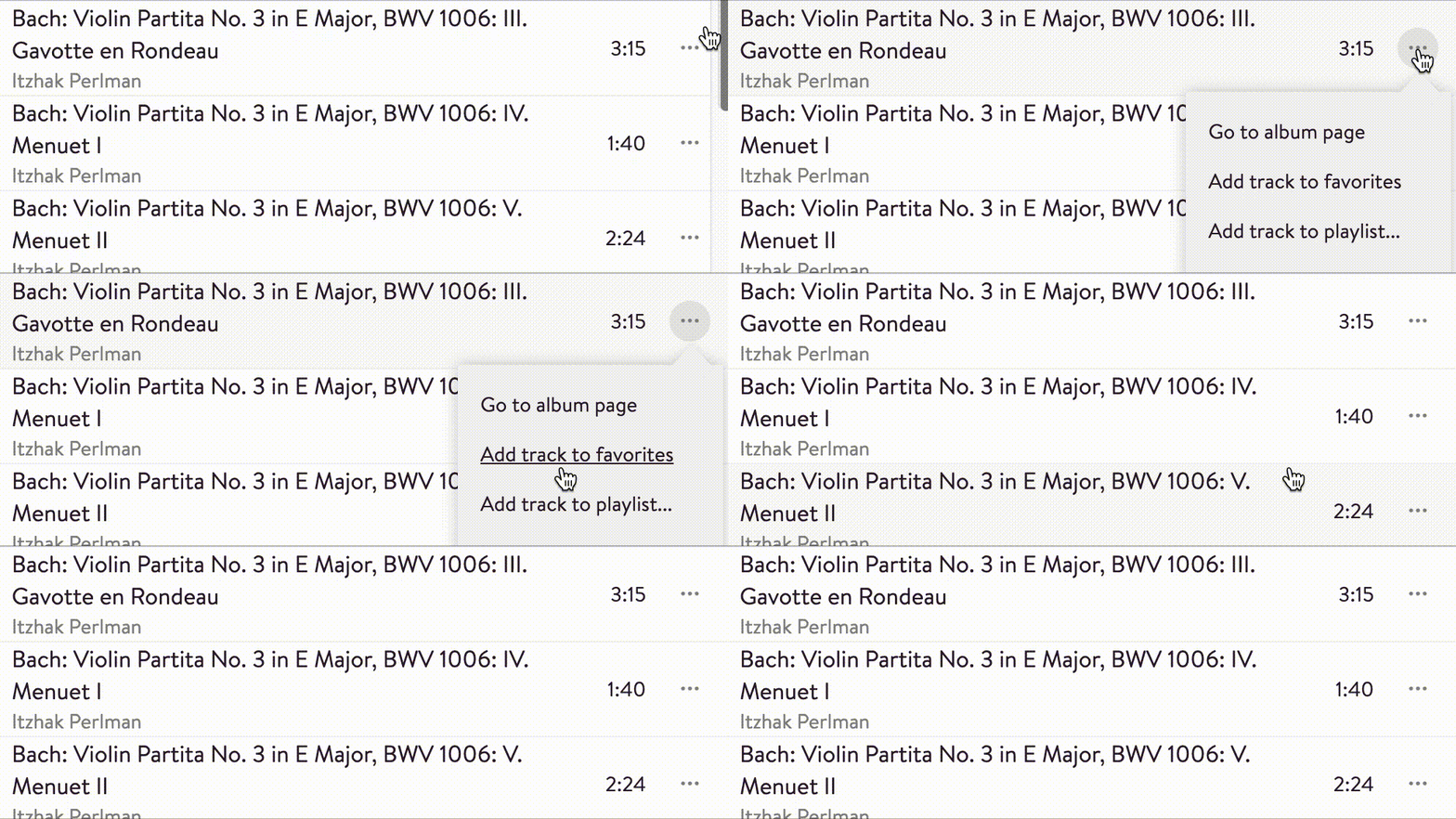
Let’s look at an example. An album is a list of tracks. Each track in the list has a couple of possible actions.

To create the Add track to favorites menu item, the server sends the following as part of the JSON definition for the entire screen:
Now when someone clicks the menu item, the client simply POSTs the contents of the payload property to the url specified in the action. The server responds with the following JSON telling the client to reload the screen to reflect the new state and show a confirmation:
This naive reload-the-entire-screen approach was simply the first thing we built. It turned out to work just fine. The apps only refresh the data, so the visual impact for our users is small.
The server already determined what the apps show on their screens. With these actions the server also determined what the apps should do when the user taps a button or item. Now the server had complete control over the user flow.
But you get really big API responses, doesn’t that kill performance?
Ok, let’s talk about performance. We do indeed put loads of JSON in an API response. For instance, the home screen is about 180KB of uncompressed JSON. Screens for large compilation albums can be up to 1.5MB. That sounds like a lot, but it pales in comparison with the amount of HTML modern websites send. Furthermore, the JSON easily compresses 20 to 30 times. That said, the size of the data sent is only one part of the performance equation. And the perceived performance is more important than actual time spent processing data.
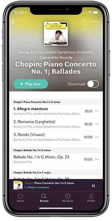
I’ll explain by first diving into what happens on the server and then I’ll get back to what visually happens on the app screen. For example consider this album screen rendered by the iOS app:

To build this screen, we need to aggregate a number of data sources from Elastic and Postgresql. We can fire precise queries for all data in parallel and then build the JSON for the screen with all data in memory and send that to the apps. This reduces the internet traffic per screen to one easy-to-compress call. By reducing the number of API calls, the reduced time to get the data to the clients already makes up for the increased request size.
Optimizing the perceived performance for the user
Like I said, how people perceive the performance of the app is more important than the actual loading time. The Server Driven UI approach automatically causes all data to arrive at the same time. This makes the transition from one screen to another easier on the eye. There is no need to coordinate the loading of the data to achieve this. For the web client we use the Vue framework. Vue will automatically compare the new data with the old and only modify the updated HTML for even less visual impact.
Another way to help improve perceived performance, is pre-rendering the header of the screen that will be loaded. To get to the above screen, the user tapped an album item like this:

The JSON for the action behind this album item looks like this:
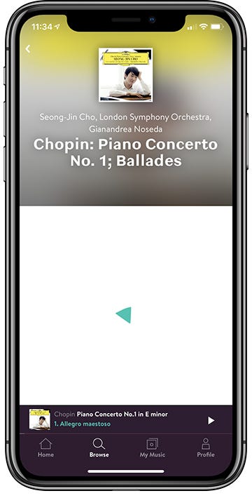
The type and url properties are needed to load the new screen. The header property is optional and contains a preview of the header for the screen that will be loaded. This allows the app to show the header instantly while the rest of the data is still loading. Immediately after tapping the album item to open the album screen, you see this:

By the time your eyes have processed the header, the rest of the data is already loaded. On the server the AlbumScreen class can generate the JSON for the screen as well as the JSON for the action to open the screen. When generating the action, it already has enough data to also generate the header preview. This makes the processing and code complexity overhead very small.
Long story short: yes, the JSON is big but nonetheless the apps feel very fast.
But how do you version this tightly coupled API and support old apps?
The introduction of the Favorites feature was the first time we had to store user generated data on the server. This would break the existing API, something that had to happen at some point. Fortunately, we came up with an elegant solution.
There are ‘Favorite’ buttons on various screens as well as a list of favorites on the ‘My Music’ screen. The list would use existing UI components compatible with the old apps. If we could hide the new buttons in the v1 API we could have a single codebase serving both v1 and v2 requests. To decouple the API code from API versions, we came up with the ApiVersionService:
In this example there are two feature flags: favorites and buttonIconRequired. favorites is not available in v1 apps, but introduced in v2. In v2 apps we made button icons optional, therefore in v2 of the API buttonIconRequired is set to false. To inject these feature flags into the API code we create a Node Express Router for each API version. Each screen exposes its endpoint under that version parameterised with the feature flags:
Now the switch to turn on the favorites buttons in the render function looks like this:
Likewise the required icon that we made optional in v2 is handled like this:
We have used this in production for a year now and we have 12 API versions running smoothly in parallel with 25 feature flags. Server Driven UI allows us to easily deprecate old API versions, and change the behavior of apps without needing to update them. We simply introduce a feature flag deprecated that we set to true for all versions we wish to deprecate. The server will show a message that the user needs to update on all screens for the old API versions.
What we previously considered a major concern turned out to be a strong point of Server Driven UI.
But isn’t your project unique and entirely unlike mine?
So far, I have been very positive about Server Driven UI. By now you must be wondering about what the inevitable catch is. I honestly don’t think there are significant downsides of Server Driven UI for our project. But our project is unique in a couple of ways.
First of all, both our data and the data structure are very stable. Our app is a data browser. People using the Primephonic app can access thousands of albums, artists and composers through very similar screens. The team mostly adds new albums and artists.
Secondly, we had limited our screen types to just two (thanks to Bram, our designer who can write code). Bram designed screens considering the multiples of subtle variations that exist in the music database. He often delivered an initial screen design in a number of different states, using the existing UI components that could be translated directly into the JSON format we had for the API. This design for the architecture made the whole process from design to production very efficient.
Finally, we were using well-established UX patterns. We were making a music streaming app. Our users would have many preconceived ideas about how our app should work based on prior experience with existing music streaming apps like Spotify. Therefore we didn’t need to invent the UX paradigm wheel, and could work with well established music industry UX patterns.
If you expect many types of screens or if you’re not sure about how your users will interact with your app, maybe Server Driven UI isn’t the way to go.
How do new team members like this unorthodox approach?
We started development for Android after iOS was well under way. When Remco and Sebas, our Android developers, joined the team, they were shocked. At first glance we were doing everything in ways we knew from experience one should never do. Remco was very concerned and wanted to make sure we had the right architecture. As a team we acknowledged that it would be healthy to evaluate Server Driven UI because we could still turn around at this point.
In an intense meeting we went over each of the concerns raised by Remco. Many of them ended up in this blog post. Some concerns we could quickly take away because we already had thought of a solution. For others, like API versioning at that time, we simply didn’t have an answer yet. Still skeptical, Remco started off his work and his initial concerns faded when he started seeing the first results.
Many months later we have had 19 developers working with the Server Driven UI API. All started out with some reservation and all ultimately turned into enthusiastic advocates.
It also helped our case that Airbnb published about their very similar adventure a few weeks before we went live. Their five-part Airbnb blog post boosted our confidence, and helped to explain the benefits of Server Driven UI to the last remaining sceptical bystanders.
But hardware audio streamers surely need their dedicated REST API, right?
Now back to the Sonos integration that started this blog post. We knew Primephonic at some point would need to integrate with smart speakers, particularly with Sonos speakers. We always figured we would need to step away from Server Driven UI and add a REST API especially for this integration. At first glance the Sonos SOAP API looked rather different from our JSON API. Screens in the Sonos app are lists of things: albums, artists, et cetera. Primephonic screens have a header followed by sections with albums, artists, and so forth.
We decided to see how far Server Driven UI would bring us. First we had to bridge from our JSON API to their SOAP API. To make our lives a lot easier, we partnered with a specialist in this area: New Media Squad. They had already built the majority of this bridge. They also helped with the review process of the Sonos integration. But we still had to provide them with the JSON for each screen in the Sonos app.
So Sjoerd first added endpoints for the sections in the existing app screens. Now we could generate screens as a list of links to separate screens. Each of those screens would have a list of things originally in a section on a screen. Next Sjoerd added a URL prefix for Sonos, where the app data would be exposed in Sonos tailored format. Together, this exposed the entire Primephonic app in the Sonos app. This worked beautifully since the screens and sections already were well thought out as logical groups of content.
Server Driven UI gave Sjoerd an entry point to write generic code that applies to all screens in the app. With every new requirement we find this to be in our favor. In this Sonos example it allowed Sjoerd to transform the entire app in just one week. This again proved the value of the paradigm. Thanks to Server Driven UI we’re confident that Primephonic is well prepared for the future.
“It’s done,” Sjoerd casually mentions.
“The proof of concept?” I asked.
“No, everything. I also added search.”
“Awesome, can we try it?”
“Sure…”
And with that the familiar notes of the Imperial March blasted through our office.
Ok, this was fun. But would you do it again?
Adoption is the best proof that something works. Server Driven UI is a paradigm that doesn’t work for all types of projects. But, since the Primephonic launch we have already completed another Server Driven UI project, and at every new project we do at Q42 we now consider Server Driven UI as a valid option. I certainly look forward to doing this again sometime. And maybe, for a few of you, this post marks the start of your own adventure!
Dedicated to Sander, with whom I started this journey but who unfortunately had to leave the team early.
In this blog post my colleague Sebas dives into the pros and cons of Server Driven UI for developing an Android app more specifically.

