Making museum websites more engaging by use of data
How we created a smart feature for the Van Gogh Museum website to indicate the true size of a painting

“How cool would it be to use artwork data from our various museum projects to engage website users even more?” That’s what my colleagues and I were discussing during our biweekly scheduled day for learning new stuff and trying new things, Tinker Fridays, or Passietijd as we call it.
We pride ourselves on building quite some digital products with cultural institutions. Therefore, we happen to have a lot of data on artworks in museums we work with. We decided to give it a try and invent some engaging features for the users of the museum websites we make.
How it all started
It all started with a joke for our colleague Tobias, who almost had his birthday. One of our projects is the Rijksmuseum website and app. We have the data of the birthdays of a lot of artists in the Rijksmuseum's collection. So we decided to make a webpage where Tobias could fill in his birthday. As a result it showed all the artworks these artists made before they hit his age, jokingly asking: “What did you do all those years? 😜”
Another client we’re cooperating with, is the Van Gogh Museum. As with the Rijksmuseum, we started thinking about what we could do with the data from the Van Gogh Museum collection. This grew out to be a very cool feature on the new website: Vincent for Scale.
Prototype
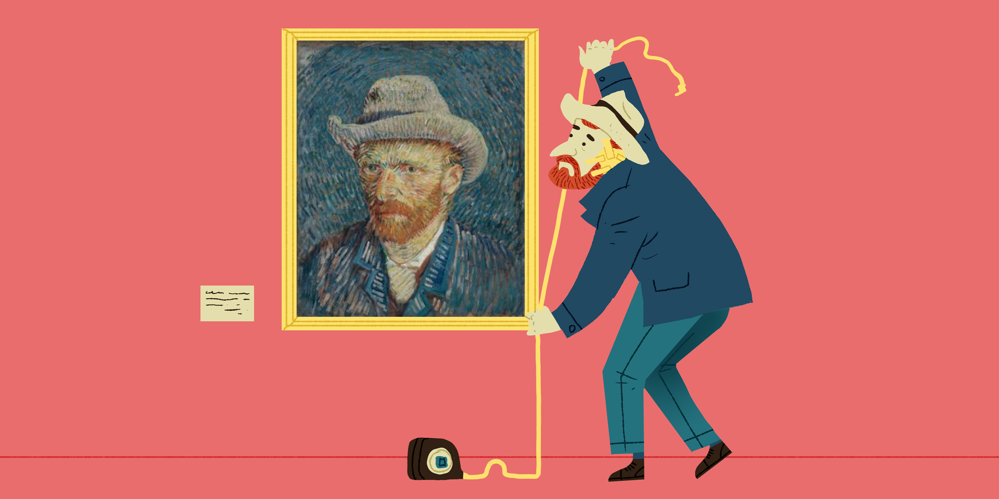
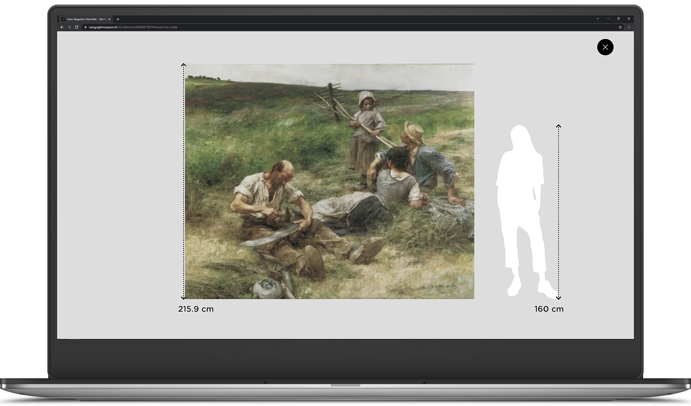
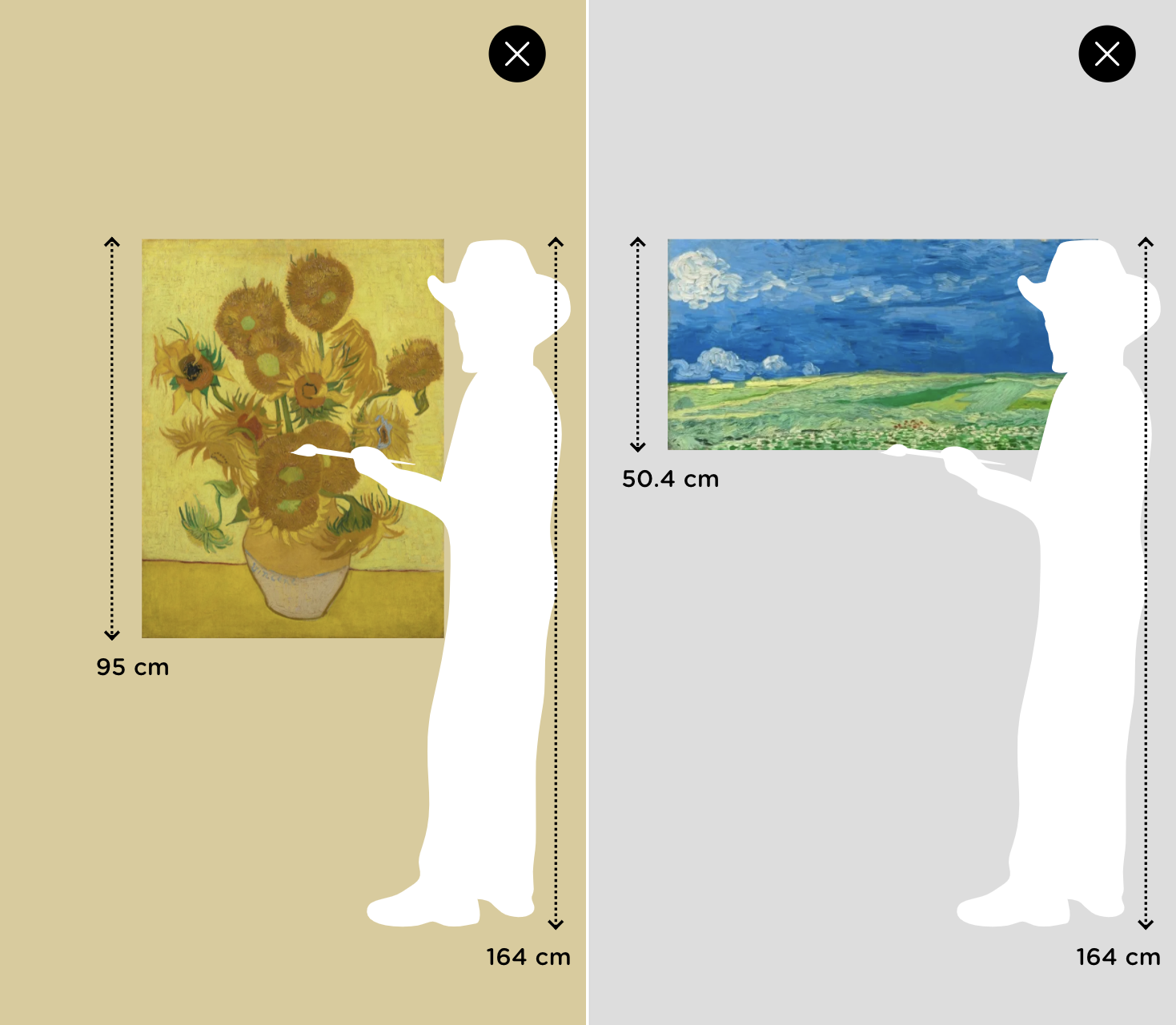
When visiting a museum, you’ve probably experienced seeing artworks and think: “Wow, this is a lot bigger or smaller than I expected it to be.” We have the data about the sizes of the artworks in the Van Gogh Museum. And all this data is available on the website, so we are able to let you know what to expect. But just displaying them in text doesn’t really help with getting the feeling of how big the artwork really is. We wondered how we could make the true size of a painting more visible. What if we show the artwork relative to a person so it’s directly clear at glance how big the artwork is? Just like the well known meme banana for scale! 🍌
To see how this would turn out, I started building a proof of concept with a few artworks from the Van Gogh Museum collection during my Passietijd. This turned out so well, that we showed it to the product owners of the museum. They were also really excited. So I started implementing the first version of Vincent for Scale in the website on the collection pages with the real data we get from Adlib. Adlib is a collection management software used by cultural institutions like the Van Gogh Museum to manage their collections and data from the artworks.
Building Vincent for Scale
When I started, I used a SVG shaped figure with a length of 175cm. It started out quite easy. The person had a height of 100% in a container element. I calculated the height of the artwork by dividing its height by the height of the person times a 100. In other words, I calculate the relative height of the artwork opposed to the person. So for example, when an artwork is 65.1cm in height, the relative height is (65.1 / 175) * 100 = 37,2%.
(this.artobjectHeight / this.personHeight) * 100
Later on we replaced the SVG with one of two options: a SVG of Vincent van Gogh with the height of 164cm for the artworks of van Gogh and for the artworks by other artists we used a SVG of a girl with the height of 160cm. Both of these work fine with the current setup.
Challenges
But, you may already see it coming, it wasn’t that easy. This feature is embedded in the website. On the web we have to deal with a lot of different browsers and a lot of different screen sizes. Therefore, the feature should be responsive and work on desktop, tablet, mobile and everything in between. Furthermore, it should also work for portrait and landscape artworks. Last but not least, we only cover artworks that are less tall than Vincent or the girl with the solution above, and there are some artworks that are bigger than 164cm. So I had to do some extra work to optimize for these cases.
To support bigger artworks, I added an extra check to the code. If the artwork is bigger than the person standing next to it, we show the person relative to the artwork instead of the other way around. To make sure it all fits the screen we first wait for the artwork to load in the container element and then get the height of the artwork in percentages.
With this information I also calculate the height of the person and set both the height of the artwork and the person on the corresponding elements. For the person I also added a style for the top position, to make sure it is always standing on the bottom of the artwork.
I also added a resize listener to execute this code every time a user resizes it’s screen, for example changing your device from portrait to landscape mode, so it always fits the screen.

To make sure it works on different devices and different screen sizes with portrait and landscape artworks, I did a lot of testing on a multitude of devices. We made the decision that it is okay that Vincent stands in front of the artworks on some screens, which made it easier to make sure everything works well. I added a few media queries in the css, mostly for landscape and portrait orientation differences to tweak the last few styling issues. Then Vincent for Scale was ready for production!

Conclusion
What started as a problem my colleagues and I experienced during our own museum visits, turned into a feature that’s now in production on the van Gogh Museum website. It’s something the museum really likes. And it helps the users to get a better feeling of the artworks and what to expect. And all that was possible with just a small part of the available data from the collection. I can’t wait for the cool stuff we will do with the rest of the data in the future!
Would you like to work at a company that gives you time off to invent such creative stuff? Check our job vacancies (in Dutch) at https://werkenbij.q42.nl!

