To Come Home: can finding mobility aids be fun?
Using disability as a quality in design and development

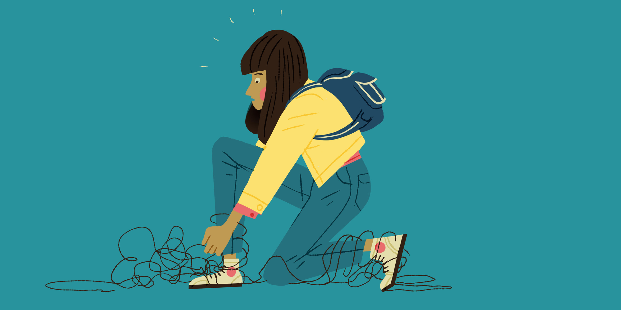
The adjective ‘disabled’ has always existed alongside my name: first as a diagnosis, then as a note throughout my years of education, and finally as an unofficial quality next to my title at work. Due to a uterine rupture, I suffered neonatal asphyxia as a newborn. Fancy terms that basically mean: my mother’s uterus ruptured during her pregnancy and I suffered a lack of oxygen and blood flow in those crucial moments, resulting in a lifelong physical fight between my muscles and myself. Also known as level 2 cerebral palsy.
I can best describe it as having another person right underneath your skin, constantly nervous and annoyingly defiant. This means that every physical activity (no matter how small) becomes an argument between you and them. You know what you want, but they’re hesitating. It’s like playing tug-of-war with a ghost that’s also possessing you.
I know what you’re thinking: why would this ever be a quality? That sounds more like the premise to a particularly creative horror movie.
The thing is, when I first joined Q42 (as a frontend development intern in 2024), I instantly learned that the more I learned as a developer, the more I discovered the right tools and knowledge to make really cool things. This has been the engine to my growth into a full-time web developer and ‘Q-er’ at Q42: my identity as a disabled developer doesn’t just mean that I play tug-of-war over my keyboard now, too – it means that I have an additional perspective on what it is that I’m making and what would be really cool for people like me. A group that, if we’re being honest, is still more likely to be seen as an accessibility checklist than a dynamic pool of users. I relate to the disabled community and as a web developer, I’ve gained the superpower of channeling this knowledge into a real, tangible product. That’s what To Come Home is.
The motivation behind To Come Home
After outgrowing occupational therapy, I noticed that the world of mobility aids and what they could mean to me started slipping away. My occupational therapists introduced me to tools like egg crackers and button hooks, but when my therapies ended, so did my awareness of what options I had.
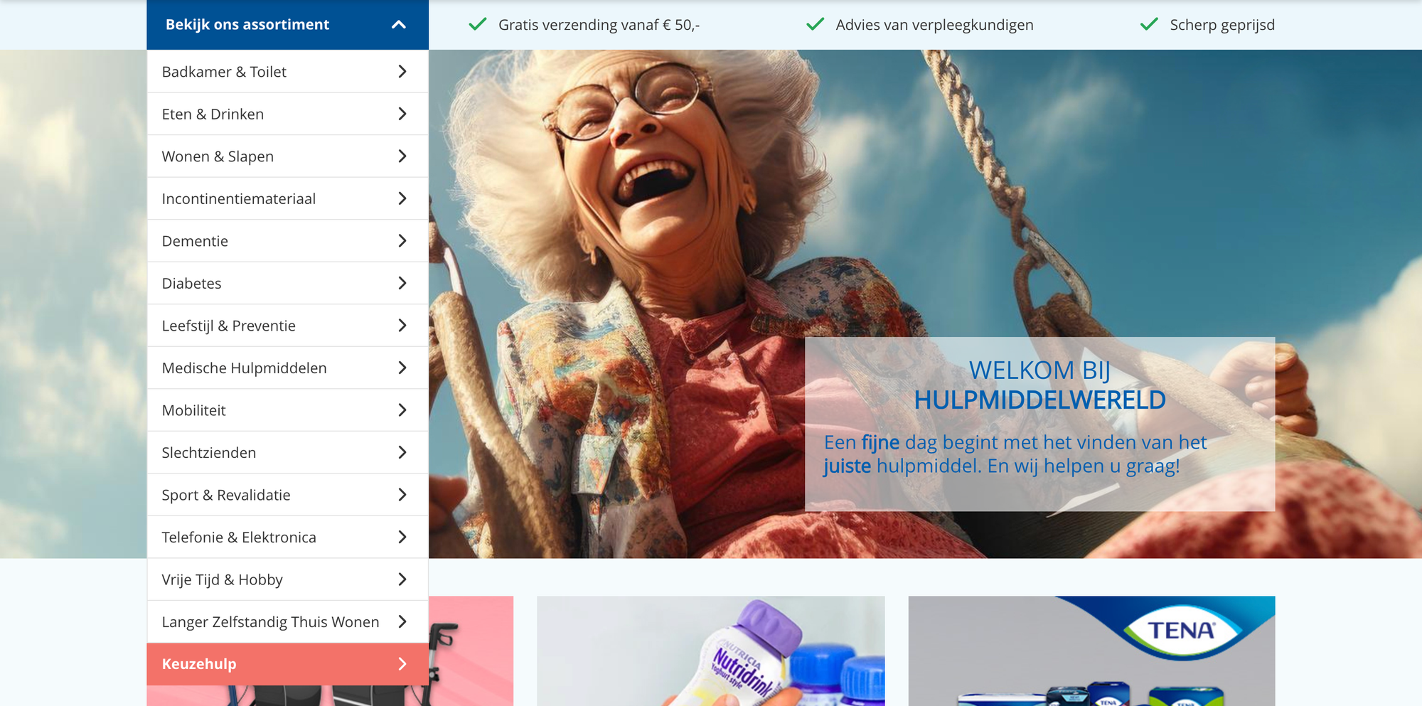
Like most people would, I turned to the web with my question, hoping to find similar tools that could aid me in my daily life, but I was greatly disappointed. My frustration wasn’t a lack of websites that were centered around mobility aids like those tools — in fact, there are actually plenty of them. My problem was how these websites were presented: static lists with pictures of particularly happy senior citizens smiling at the camera and slogans like, “Reclaim your independence” and “Feel young again!”
All of it positive and practical, but when you’re trying to find representation of yourself as a young disabled person, being met with messaging like these ones can have the opposite effect. You walk out of your final therapy session, pull out your phone, and discover that you’re… invisible, apparently. Non-existent.
Because of this, I felt passionately about what To Come Home would have to be. Think about what coming home feels like — taking off your shoes, putting down that heavy bag you’ve been carrying all day, slipping off your coat and finally being your unbridled self. That’s the feeling that I wanted the journey of looking for mobility aids (and finding them) to mimic: a website that felt like returning home, where disabled people found tools that could genuinely help them move throughout life, exactly as they are. This decision quickly cemented itself as the starting point of my graduation project. Wherever the project would go, the metaphor of coming home would have to be its core and inspire everything thereafter.
Taking shape (or: construction)
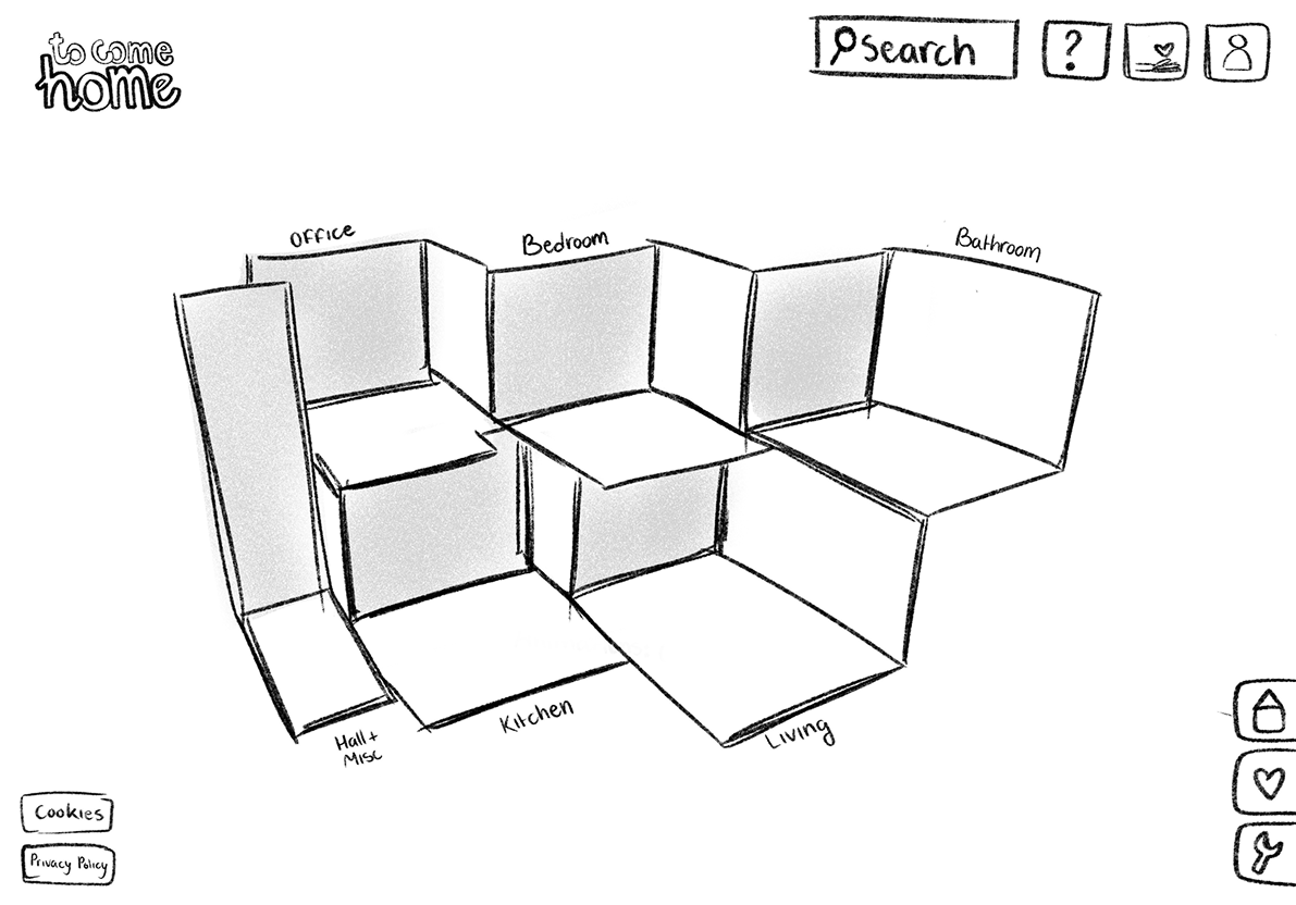
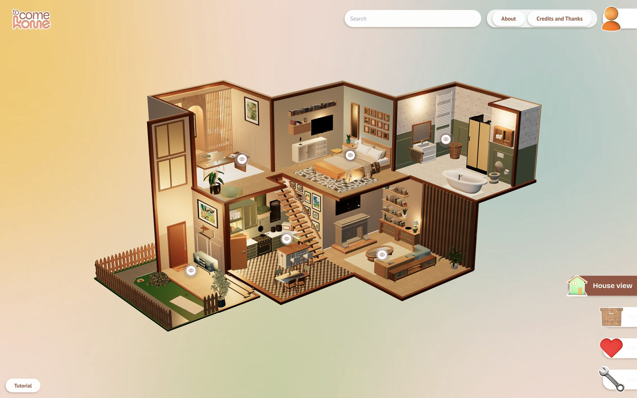
Once I established the coming home metaphor as the centerpiece of my project, I immediately started thinking about how to incorporate it in this website. I’m sure it’s not a major shock that I ended up using a house as the site’s main navigation, but there are multiple reasons why this choice was the right choice.
For one, my target audience. Before I started building the site, I set up a test panel consisting of five disabled young adults from around the world by posting an unnecessarily sentimental post on my Tumblr blog and inviting them to my Discord-server. Here, we did some exercises, discussed existing solutions for the problem I’d identified (why does the web seem to think young people never use mobility aids?), chatted about our disabilities and talked about how we viewed the web as a direct result. This group tested not only my eventual site, but also each preceding prototype and the very ideas that came before them.
Since their ages ranged from twenty to twenty-seven years old, I specifically utilized their experiences growing up with technology as we know it today, meaning: flash games, handheld game consoles, and the intuitive and unique ways of navigating in these environments that has made this group of users especially tech-savvy in a way older generations aren’t. This quality could be exactly what made To Come Home theirs.
Secondly, I sought a clear contrast between what frustrated me about these existing sites and what would resonate with my target audience. I decided to do the opposite of what these sites commonly did, refining from there. This meant, stripping the sites to their core and finding other solutions for the same challenges. My test panel and I discovered what the greatest issue was: disabled people are capable of a lot more than what people think.
Now that I’d put them on center stage, we started defining their perfect website. A website that didn’t assume it knew exactly what they needed, but instead had faith in their capabilities, and let them define their limits themselves.
🇳🇱 👋 Hey Dutchies!
Even tussendoor... we zoeken nieuwe Q'ers!
The concept
While my test users had validated the concept of a literal house for finding mobility aids, I also wanted to hear from medical professionals. I hoped To Come Home would aid in the journey of self-acceptance while growing up, and I wanted to know if it truly could.
So, I reached out to my childhood rehabilitation center. I still had my old psychologist’s email saved (she single-handedly hauled me through high school) and told her about my concept. I also went on a ‘tiny’ spiel about what occupational therapy really meant to me as a kid. Essentially, child-me had always seen occupational therapists as magicians, because they always had the perfect tool for what I struggled with. The good news was, she had time to chat about the concept and she knew an occupational therapist who was excited to join!
Almost immediately, they echoed the exact sentiment the members of my panel shared. This group was disabled, sure, but most platforms that sought to cater to this aspect of their identity seemed to forget that their disabilities were strictly physical. Instead, users were often addressed like children or bypassed altogether. Some websites refused to acknowledge them and adopted another language entirely: instead of ‘you’, these sites were for ‘your child’, assuming that only caretakers would browse the site and not the user themselves.
The untraditional form of the site required me to thoroughly flesh out the accessibility, the professionals emphasised, but they believed I could and were thrilled about the concept. The question of whether it would be ‘appropriate’ was quickly answered: it was. My proximity to the audience and collaborative approach cemented this as fact. And my ‘disabled’ quality did, as well.
To furnish a house
Although the home metaphor was the driving force behind every decision made, To Come Home didn’t revolve around the house, but around the mobility aids and tools that would populate it. This was because, notably, my test users weren’t at all confident about their knowledge of existing tools that could be of help to them. They were very aware of which areas of their daily home lives were especially difficult and which activities they struggled with regularly. However, since accessibility wasn’t something they knew much about, most of them ‘made peace’ with the fact that some things took more time or seemed impossible.
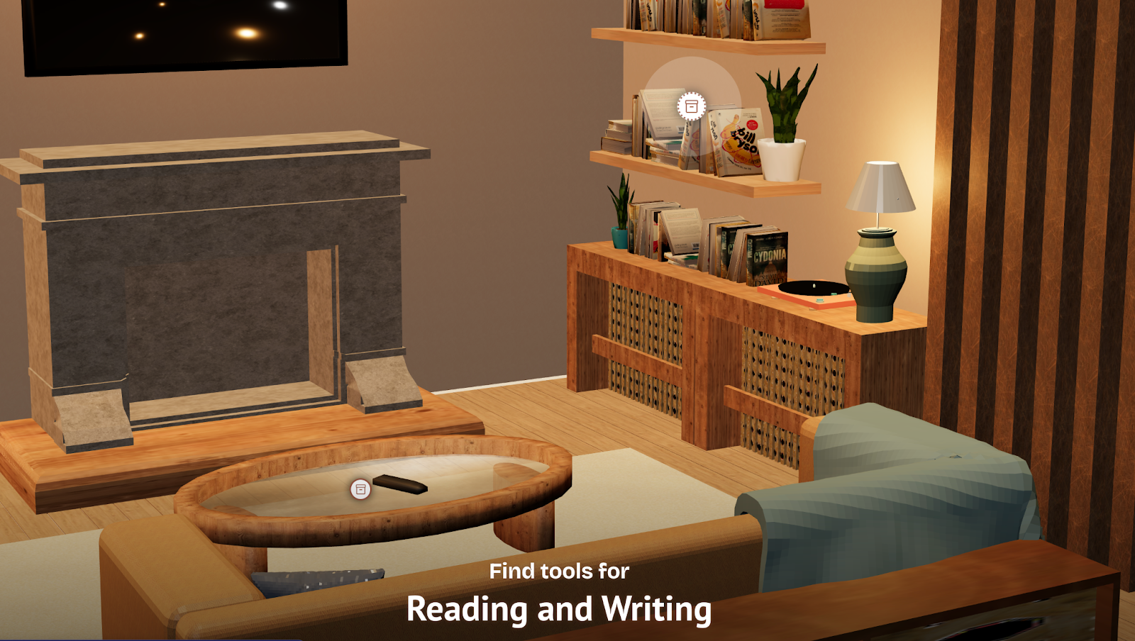
We tied this to the house concept by thinking of ways they would intuitively explore the website, keeping in mind that while they could name what they struggled with, they wouldn’t know what kind of tool they were looking for. For this reason, I created hotspots that were intuitively named after specific activities in the house.
In the kitchen, there would be ‘Eating and Drinking’ and ‘Preparing Food’. In the bathroom, ‘Showering and Bathing’ and ‘Getting Ready’. While my users wouldn’t go looking for egg crackers, specifically, they’d probably know that cooking was hard for them and find the egg cracker in the kitchen, which solved the problem of not finding tools because they didn’t know where to start the search.
The third dimension
Months before approaching my user panel and pitching my idea to my university, I’d already ventured out to assess the realism of my house idea. As my internship at Q42 approached its end, I discussed my idea with various Q-ers to gauge its feasibility. It was in this phase that I considered going 3D. I didn’t want to go there just for the sake of it — if I added this layer of complexity, it had to serve a purpose. Luckily, the Q-ers I talked to loved the idea and saw the value for my target audience.
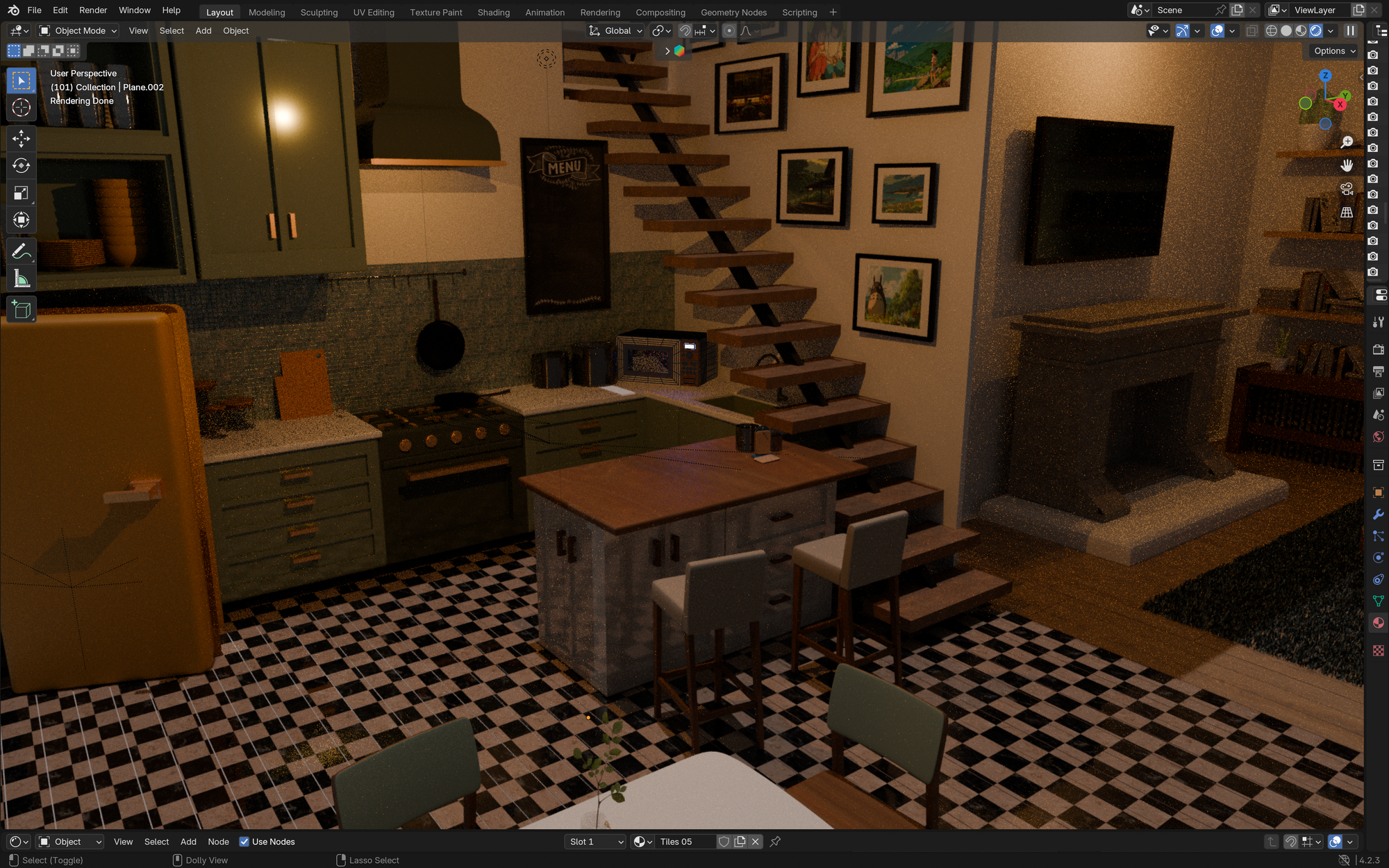
When w00tcamp, Q42’s yearly hackathon weekend, came around, I locked myself in my house and committed to learning 3D-modelling in Blender from scratch. I had a clear vision of what the house should look like if I truly followed this idea through, and wanted to create it myself. (Read: I just couldn’t trust anyone else and was being very stubborn.)
Anyone who’s ever had the courage to open Blender knows that the first visual you’re hit by is a cube in a 3D-space. This cube can be found in the actual site model; it’s the first block of the kitchen counter next to the refrigerator. This kitchen counter was the perfect starting point for learning 3D-modelling. It introduced me to all the Blender features (or at least the most important ones) I’d need when building the rest of the house, allowing me to go from building that first cabinet to the refrigerator, the stove and the dining table, until the entire house was filled.
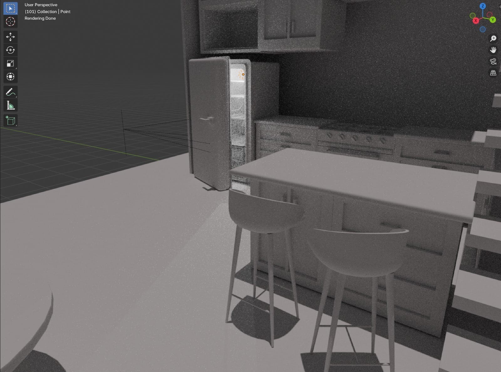
I just had to bridge the small gap between rendering and creating a model within Blender, and then displaying it correctly on the site (or, as I envisioned). First of all, as a complete Blender newbie sans teacher, I had a mini-heart attack when it was time to add textures and materials to each of the hundreds of objects. The sheer number of objects scared me, as my perfectionistic self was still clutching the vision of her perfect house to her chest. But there was also the scare I got when I innocently Googled ‘how to add color to Blender model’ and was met with… this.
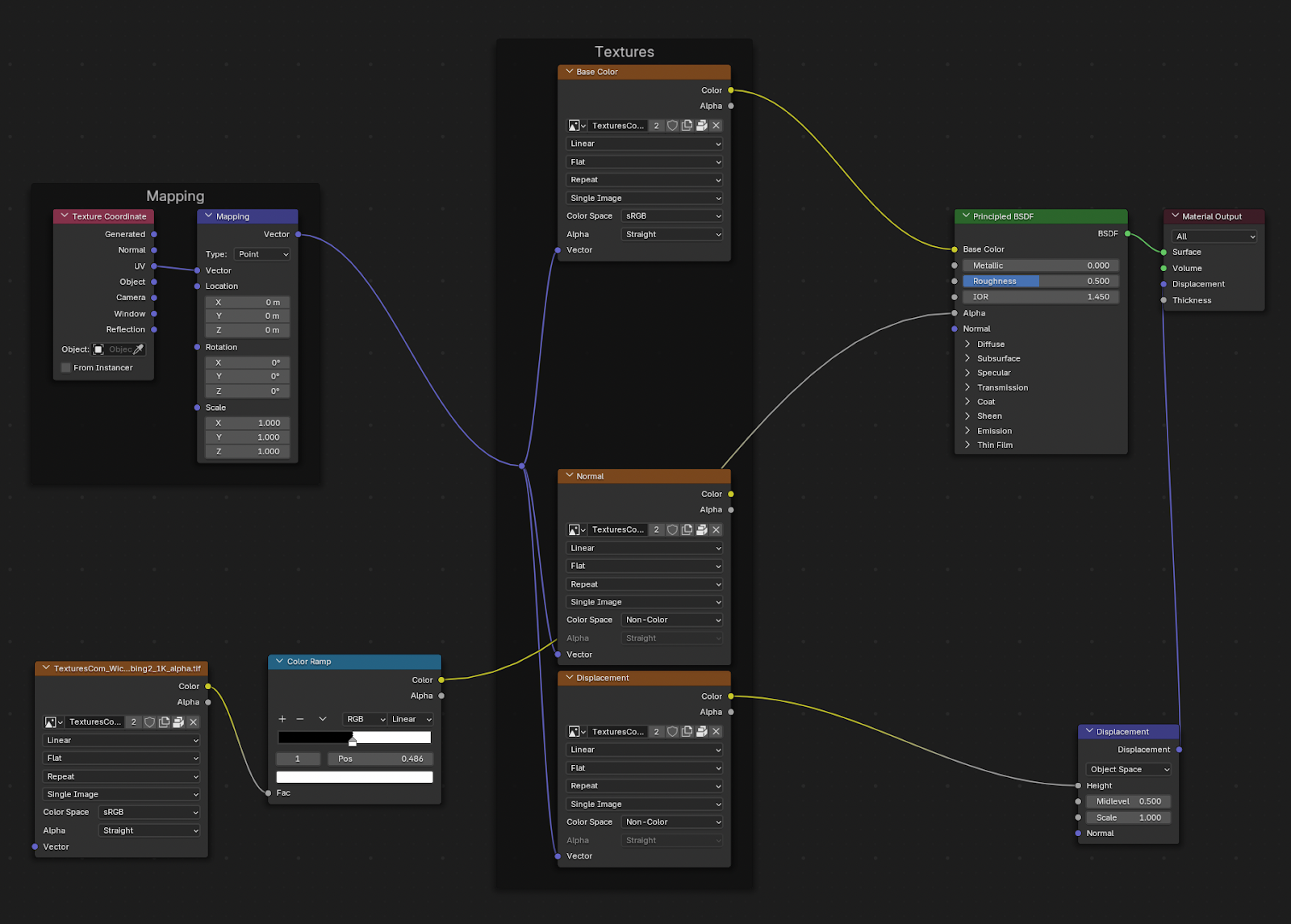
My heart sank when this seemed to be the answer to what I thought was a normal, simple question. YouTube tutorials (my usual saviors in such situations) didn’t make me any wiser. I desperately started telling myself that having a grey model on the site wouldn’t matter much (it would and I was starting to panic).
Luckily, just like in the world of development, I didn’t have to reinvent the wheel. Thanks to the built-in material library — an add-on I could enable in Settings — I could browse endless pre-made materials and apply them to meshes, and even parts of meshes, adding a new layer of realism and life to my model.
The house was then easily integrable with React via ThreeJS and a number of additional packages that would give me the ability to control the 3D environment on the website itself. The react-three package allowed me to control the ThreeJS canvas using React, while packages like react-three/drei provided add-ons with features programmed by react-three users. I also used react-three-fiber to attach React states, for example, to elements in the 3D scene. This combination of packages made it possible to set the scene with as little code as possible, while also making the model interactive and reactive where necessary.
Characteristics and population
At the start of this process, I gathered input from my test panel through individual interviews that had the tendency to turn into informal conversations of several hours, and group discussions that became sessions of complaining about the web and fantasizing about could-be’s. This is also where I showed the panel my 3D-model, prompting one panelist to ask, “Bri, do you do interior design? This is such a gorgeously fleshed out model, it’s on par with the ones I see from the landscape architect I work with.” I had to tell her that my background in interior design was really just me playing the Sims since I was nine years old.
Now that the house model existed, I could add hotspots and truly bring it to life for my users in the way we discussed.
Data and users
When it came to the data, I knew I could search for databases on mobility aids and tools, but what caused me some skepticism was the subjectivity of the term ‘mobility aid’. While many tools are designed with a certain disability in mind, sometimes what qualifies as a mobility aid is simply its ability to help someone move around or complete tasks that require physical movement or effort. The egg cracker, for example, is marketed and sold as a regular kitchen utensil. Whether or not this would qualify as a mobility aid depended on my users. Did it help them? Would they recommend it as such?
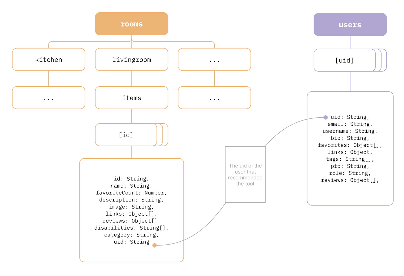
This led me to a huge part of To Come Home: it’s powered entirely by its users. There’s no pre-defined database at its core, filled with medically approved tools developed by occupational therapists; instead, users fill the catalogue with their own recommendations. I recommend the regular egg cracker because I don’t have enough control over my hands to crack eggs myself, making it a mobility aid to me. Someone else recommends a V-shaped pen because their Ehlers-Danlos Syndrome makes it hard for them to use regular ones, another mobility aid.
This required me to set up a form that would work with my front-end and data setup, as I wanted my users to be able to add data themselves through an interface. The way I set up my data is as follows:
A vision for the future
It’s been a little over three months since I handed in the project to school, and in that time I’ve already gained a lot more knowledge than I had when I was knee-deep in the development of To Come Home. Since the site is still very much a prototype and I know how to improve upon it, it’s not something I feel I’m done with yet.
It would be cool if users could navigate from room to room, or if different tabs for different user roles allowed medical professionals (like the occupational therapist and psychologist I interviewed) to add their expertise to the catalogue. I want to improve on the performance, responsiveness and adaptability of the interface. And I want it to be a ‘real product’ one day. Solid, steady and reliable.
I’ll let you know when I’m there!
Do you also like to go the extra mile to make websites more accessible? Then please do check our job vacancies (in Dutch) at https://werkenbij.q42.nl!