
Squarespace without limits for museums
How we built a next-gen modular framework to power unique museum websites and innovate cultural tech


No two museums are alike. Step into one, and you might find a history of footwear; step into another, and you are surrounded by medieval art. Each institution holds collections and stories that simply cannot be found anywhere else.
Yet when you look at the challenges museums face online, you find a striking amount of similarity. They all want to share their opening hours, highlight current exhibitions, and showcase their wonderful collections. They also need to provide tailored information for specific audiences, such as school groups or senior visitors. When you really think about it, the bulk of museum websites share remarkably similar structures and requirements. And that is precisely where we saw an opportunity.
Over the years, we have built digital experiences for world-renowned cultural institutions like the Rijksmuseum, the Van Gogh Museum, and the National Gallery. However, we also noticed that many smaller museums simply don't have the funds to develop a tailor-made, hyper-custom website. What if we could make a system for producing websites for museums, which encapsulates the common functionality across them, but does allow for individual management of content and collections, and most importantly: provides totally different looking websites? If successful, museums would be able to have a beautiful, custom-made website for a fraction of what they otherwise would need to pay! ✨
One’s mind might drift to generic solutions like the infamous WordPress or Squarespace, but we wanted to create a system that is highly extendable, fast, reliable, with a content management system that is specifically offered on a per-museum basis, to allow for controlled deviations required on a case-by-case basis.
That is exactly what we built.
We didn’t want to apply a template-like layer of paint to a generic looking website. The frontends created with our system are custom-designed and implemented using a highly themeable and configurable structure. They are modern, statically pre-rendered using SSG (with a cache that auto-updates on CMS changes), blazingly fast and easy to navigate.
Of course, something like this has been attempted before, with varying degrees of success. But we believe our solution is a particularly smart one, striking a nice balance between maintainability, a smooth structure for adding new museum websites, and a model where every additional museum profits from everything that has been created before.
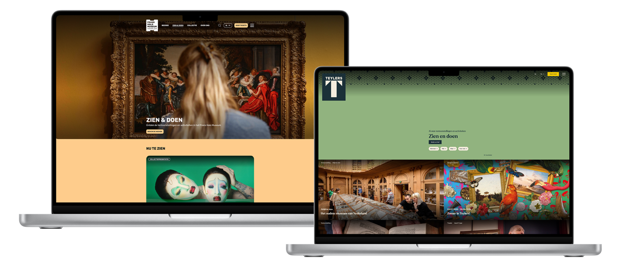
We call it: Online Museum Framework (Online Museumplatform in Dutch). To prove the power of this platform, please experience these two sites: Frans Hals Museum and Teylers Museum. Can you even spot that they are created using the same system? Or only because we said it in advance?
Technical vision
While we found that museum sites often have similar structures and features, they do have very distinct visual identities, and diverse types of content. Because these identities reflect the cultural core of a museum, allowing them to be expressed as much as possible is of utmost importance. So, creating a traditional white-label platform that offers some basic templates was simply not going to be enough to realise our vision.

Our biggest challenge was to strike a perfect balance between creating a system that just replaces colors and fonts for each website, and creating an entirely new site, with full custom styling, for each one. The further to the left, the easier it is to add a museum to the system. But too far to the left, and it starts to become painfully obvious that the same system is used for each site. Furthermore, the identity and branding of each museum cannot be accurately and playfully represented if we drift too far to the left.
On the other hand, the further to the right, the more impressive and detailed each site will be, with ample opportunities to reflect the uniqueness of each museum. But... the design and development time required increases dramatically, and the whole thing starts to become less of a system, and more just individual unrelated sites.
Formulating and implementing an abstract ‘museum language’ that encapsulates the overlapping aspects of the museum landscape, while allowing the expression of different kinds of UI elements, layouts, fonts, and colors, was of paramount importance. This language had to be extendable, understandable, and not easily breakable.
To this end, using custom CSS stylefiles for each museum was not going to cut it. We have far too much experience with the quirkiness and unpredictability of CSS, and the large amount of time required to implement a design with it, especially if the underlying DOM patterns stay relatively fixed. Furthermore, making changes very easily breaks stuff. So, we had to come up with a higher-level configuration on a per-museum basis, as well as an accompanying design system that defines layouts and component options without imposing identity.
Another core principle was to make sure that every museum could benefit from changes and improvements to the system at all times, not only when that specific museum has the opportunity to finance further development. This was not just a conceptual effort, but also something that needed to be enabled by the tech. To facilitate this, we chose not to have versioned releases, so that we could release bugfixes and improvements to all websites simultaneously. This way, each website and museum stays up to date with relative ease! During the pitching rounds to new museums, this became a key selling point: the budget of each one is limited, but if each one can profit from the investments of all the other ones, the offer becomes a lot more appealing!
Of course this approach also has some potential drawbacks: each change has to stay compatible with all the deployed sites, and if one museum really wants something specific the others do not need, we need to fit this within the common configuration language without altering the other configs. We tried to look at this as a challenge instead of a hurdle, and we think we came up with a very flexible, robust, and extendable solution!
Stack
Next.JS is a modern framework with a convenient deployment cloud infrastructure: Vercel. It suited our wishes perfectly, allowing us to easily create deployments with different theme files and domains for each museum, all from the same codebase. Vercel also deploys a CMS for each museum, which has UI options for the content editors that are also derived from the configuration language (more details later), using the Sanity CMS. Sanity is highly configurable during build time, which was exactly what we needed.
And to assist with styling and theming, we used Tailwind. We created a validation pipeline which parses the theme configs, and generates a tailwind configuration at compile time which injects all kinds of theme variables and classes for use within React components. For readability and modularity, our theming system pairs with the semantic naming conventions of tailwind.
Now, let's dive into more details about each part!
🇳🇱 👋 Hey Dutchies!
Even tussendoor... we zoeken nieuwe Q'ers!

The core of our solution: theming
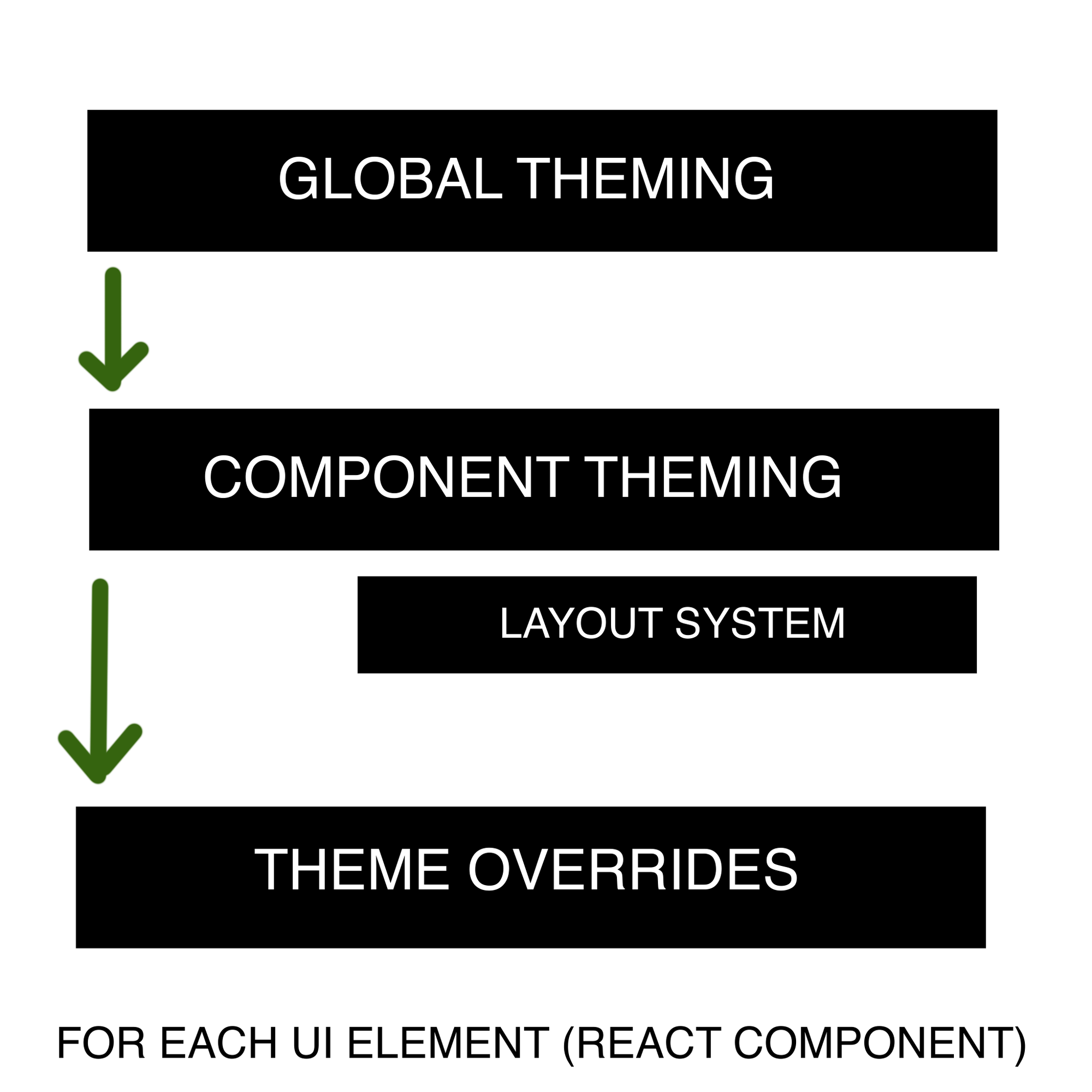
The core of our solution was an abstraction layer we call theming. We set up a theme system on three levels: global theming, component theming (including a layout system) and local theme overrides. We defined them using Typescript objects, giving us a typesafe, easily documentable way to define themes.
Each museum has the same core functionalities. The most notable ones are a collection of objects, a homepage, a navigation bar/menu, an overview page of events, content pages with content blocks and collection object pages.
We defined these functionalities using React components, and filled them with content from a museum CMS (Sanity). Each component derives its styling from our theming system.
Global theming
The global theming consists mostly of design tokens and variables like colors, font sizes, font families and spacings. As we are using Tailwind CSS as our styling framework, the global theming basically results in a Tailwind configuration file. This theming layer already lays a foundation for the look and feel of the museum and will bubble through all pages and components. But as said before, this is just the first step. You can see it as a broad coating of paint, covering the entire website.
Component theming
The second layer, and also the most important and impactful layer, is component theming. Almost every component in our codebase has its own theme file and configuration. The theme effectively dictates what is allowed to be customised and therefore keeping full control of changes within that component file, like we determined in one of our principles. Most of the properties that are part of the component theme are things like typography styles, colors and spacings. One of the challenges was in keeping these consistent throughout the codebase. We do so by adhering to CSS naming conventions, reusing certain types and patterns and through theme overrides discussed in the next section.
As part of our component theming, we designed a powerful layout system that allows components to define different layouts for their sub-elements in a named, convenient way. As a textual example, the slideshow component has a number of elements within it: slideshow indicators, the current slideshow image, a header title, a subtitle and arrows left and right. But with spacings alone, not enough variability is created.
So, we allow elements to be optional (maybe museum X doesn’t want a header title on their slideshows). We also allow for layouts orderings. For example, a layout for the slideshow can say something like this: Put the slideshow indicators at the bottom right, with this amount of margin. Put the header title of the slide in the middle top. Don’t use subtitles. Space the arrows far from each other, and underneath the slideshow image.
These layouts definitions open up a whole new level of customisation, and give designers a plethora of new possibilities during the creation process of new museum designs.
A concrete code example: look at this snippet, that defines a slideshow layout within our system:
| Slideshow layout |
|---|
|
As you can see, our layout definitions have some commonalities with CSS, but they operate on a more formal, abstracted level, defining rows, placing elements in rows, defining orderings with named sub-components, and defining spacings. In other words: a perfect balance between formalisation, and freedom!
Of course, not all components need layout definitions. For example, the theming of a button mainly consists of colors, typography and spacings. But some of the more complex, higher-level elements can benefit greatly from the added possibilities.
Theme overrides
A final, optional layer of theming is something we call theme overrides. It solves the problem of context. While consistency in design is very important, it is inevitable that there will be exceptions when components are placed in hierarchies. A button within a card might look different compared to a button in the navigation bar for example. To allow for these ‘exceptions’ within designs, we created a way to override the theme of components based on the context in which they are used. This override is basically a deep partial object of the original theme of that sub-component. Example: a button within the top navigation bar needs to have a different background compared to a button within a text block on a content page.
Card example
To see a simple example of our theming system in code, look at the Card component:
| Card |
|---|
|
As you can see, in essence, this is a React component, with some props and a template. What we added to every component is a theme object, which is injected with a getThemeComponent function. Instead of applying classes hardcoded, the getClass utility function is used to dynamically apply the corresponding class based on the theme values. Possibly with desktop overrides for responsiveness (see the example below):
| Card theme |
|---|
|
The theme definition of the component is defined in a separate theme typescript file.
| Card theme definition |
|---|
|
We use a semantic naming system for spacings and colors, and define the possible options on a per-museum basis in the global theming section of the config.
From design system to deployment
When a new museum needs to be added, a design must be created. The designer works within our design system, so that in theory, zero lines of actual code need to be written to implement this new design: pure configuration.
To help future designers, we created a figma design system with unopinionated grey components (no identity), that defines UI possibilities and layout options. But within this system, beautiful designs can be created! And if a museum really wants new functionality, we can discuss adding it to the system as a new component. The beautiful aspect of this approach is that we extend the system vocabulary this way, and strengthen the pitch to new museums.
Next, if the designer correctly adhered to the principles we established, their design maps to config options in our codebase.
We also allow for the creation of variants , which automatically bubble through to the CMS of a museum. Example: for Teylers, for card list pages, we want a horizontal large card (full size image, text in the middle, subtitle below). We also want a vertical small card (image at the top, text and subtitle with a colored background at the bottom). In the configuration for Teylers, we can define these different layout options, give them a name, and they get automatically added to the CMS of Teylers during deployment. Handy for their content editors!
We spent a lot of time streamlining the process of going from a museum identity to a design that adheres to the abstract language we formulated, to implementing that design without writing code, and deploying it. The resulting deployments use server-side rendering for speed, and are highly optimised for SEO, which gives our system a big edge over, for example, a WordPress solution, as these types of sites use outdated javascript, often very long loading times, and poor SEO optimisation.
Challenges
As with any project, challenges will arise that might lead to a necessary refactor or buildup of technical debt. This project is no exception, certainly due to its evolving and organic nature.
We kept a nice balance between development speed, and refactorings / optimisations. Let's discuss some main hurdles we encountered along the way.
Zod schema validation limitations
At an earlier stage the idea was to apply the theme at runtime, so that we might be able to have just a single deployable build to be used for all museum websites. This meant we had to store our theme files as JSON. To make sure themes were configured properly we used a schema validation library called ‘zod’. While it is a great library, and definitely recommended for the right use case, we noticed our codebase slowing down severely. It turned out that our theme configurations and especially the nesting within it was so deep, the generated Typescript types from the Zod schema were actually hitting the limitations of Typescript, resulting in excessive depth errors. Frustrating!
Update: in Zod version 4 this is massively improved, because the package has gotten much more lightweight and efficient.
We decided to refactor this approach to plain old Typescript types, with the added benefit of having autocomplete while configuring theme files. But this meant we had to move the validation and generation of a museum site to compile time. This makes doing fast deployments of changes a bit less convenient, but it keeps the large flexibility and extendability of our system, so we went for it.
Each museum has a folder containing a theme configuration, and after a codebase push, the different museum sites and CMS’s can easily be deployed with the click of a button in Vercel.
Dynamic styling
This was an interesting one: during compile time, Tailwind decides which classes need to be added to the build bundle. But, based on the theme configurations, we formulate a large amount of Tailwind classnames (strings like mt-3) by string concatenations. Tailwind did not understand which classes to add!
So, we devised a solution: we wrote a Tailwind whitelist generator that, given a theme configuration, generates a long list of the possible Tailwind classes that specific theme may need. This list is added to the Tailwind whitelist, causing them to be added to the build bundle. Solved! This is not the most elegant solution however, because a large amount of classnames in the list could be used, but that doesn't mean they are. Exploring a different theming framework may be worth it, to remove the overhead of this class generation and to decrease the bundle size of the application.
Conclusion
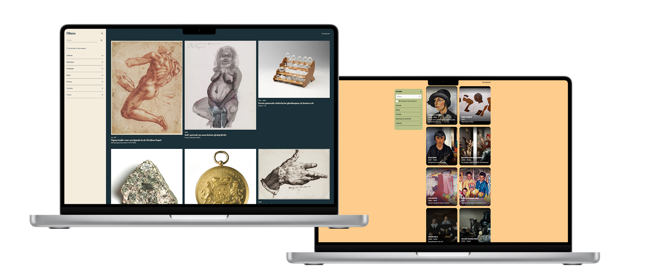
As part of the initial development of the Online Museum Framework, we launched with two museums. Because of their respective timelines, we started out implementing the design of Teylers Museum first and implemented Frans Hals Museum design later. It was the ultimate test to see how much effort it would take to add a museum, and how unique its design and branding could be. It turned out to be a great success! Because of the flexibility of our theming system and the core components we were able to implement a very different design quite well. It isn’t just a layer of paint, the structure and layouts of the two sites are quite different, as you can experience when visiting them.
For the addition of the Frans Hals museum, zero lines of CSS were needed. It is driven entirely by our config system, from which the Frans Hals CMS is created and hosted for their content editors, providing specific UI options. Mission accomplished!
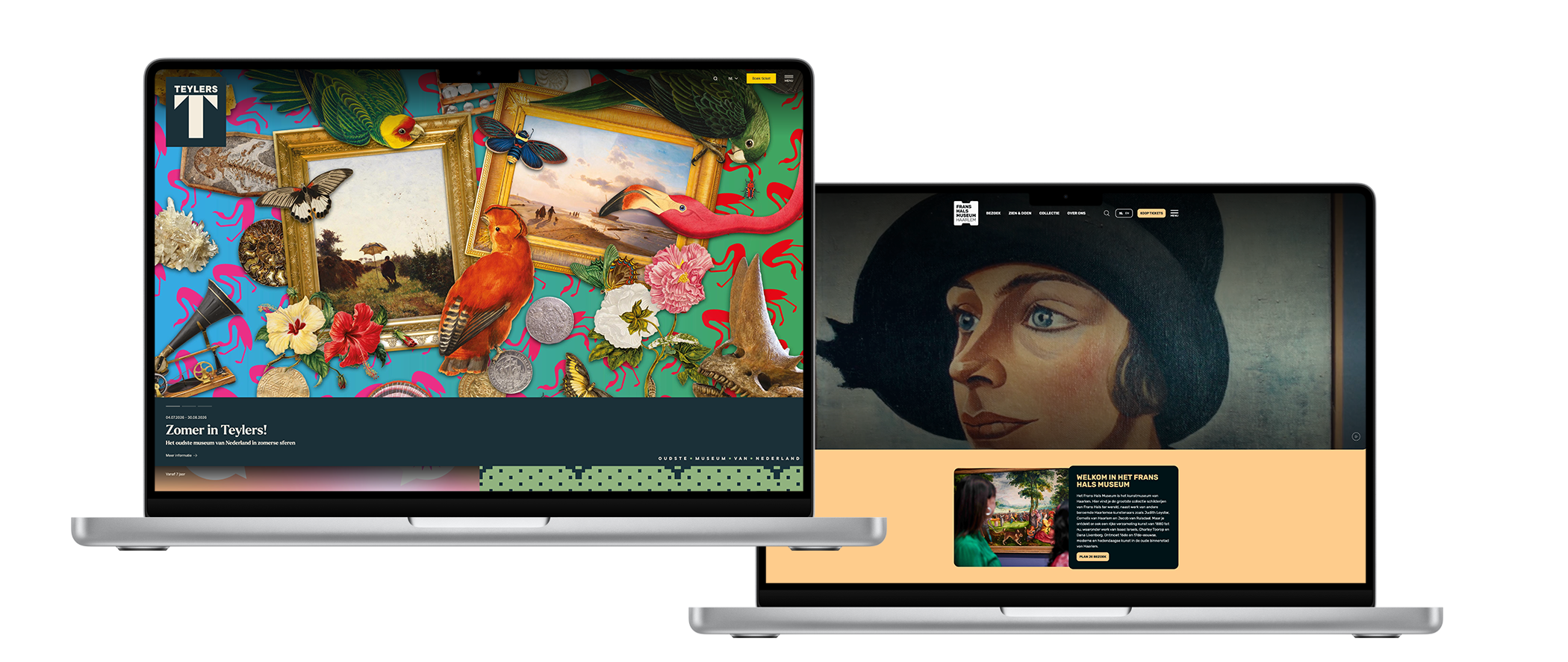
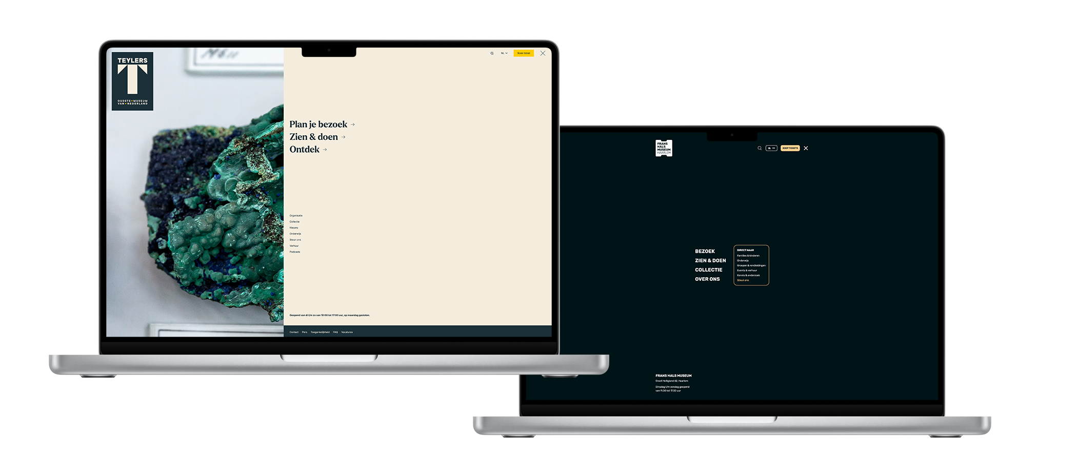
We are happy and proud that we were able to ship these two unique websites using a single code base and platform, and a third one is already live! As with any project, there are of course things we would like to improve to make the implementation of new websites easier and faster, make the platform more scalable and enrich it with more features to add value. Nothing is ever finished, and that is fine. Hopefully this post shed some light on our journey, approach and challenges, and maybe even provides grounds for some inspiration. Happy coding — and check out the websites already using the Online Museum Framework:


Do you also like these kind of technical challenges? Check our job vacancies (in Dutch) at werkenbij.q42.nl!