Implementing Dark Theme in your Android app
Android Q wants to be friendlier on the eyes by introducing a Dark Theme. This post explains how this new mode impacts you and your users.

How the new Android Q night mode impacts you and your users
Android Q strives to be friendlier on the eyes by introducing a system-wide Dark Theme. This new theme is easily enabled in the Quick Settings panel and it changes the color scheme of the system to all-dark, making the whole Android experience nighttime friendly to your eyes. An extra win is that it also lowers battery usage on OLED and AMOLED screens when using true black. Therefore, it is auto-enabled when the battery-saver is switched on.
You might know about similar settings on earlier Android versions, but these could only transform part of the interface. On Android Q, Dark Theme is system-wide.
Ignoring Dark Theme is an option
If you did not make any changes to your app (and are not using the DayNight Theme already), you simply do not support Dark Theme. You can safely set your target-sdk to Android Q, Dark Theme will not affect your app in any way.
However, this will make your app the odd one out, shining all kind of bright colors right in your users face. Since that will degrade the user experience, it really is encouraged to include Dark Theme support within your app. Users will start to expect this after Android Q is released.
Note that if your app already has a dark layout you’re the exception and don’t have to change anything: you are already blending in with the dark design.
The quick fix to support Dark Theme
The easiest way to support Dark Mode is to let Android handle your style for you. You can preview what this does on Android Q by enabling the ‘Override Force Dark’ developer setting on the device. This will force-swap all apps to the Dark Theme and you can preview what will happen to your app if you would implement it.
To actually implement Forced Dark in your app, start by configuring Android Q for your project as described in the migration guide. After that, simply add forceDarkAllowed to your app’s (Light) theme:
<style name="AppTheme" parent="Theme.AppCompat.Light">
    <item name="android:forceDarkAllowed">true</item>
    ...
</style>
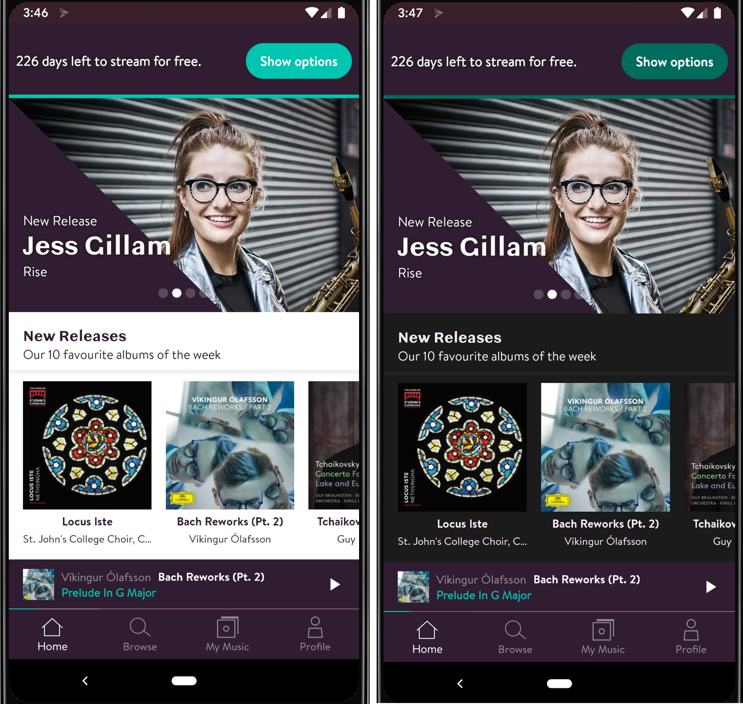
This allows the OS to force Dark Theme on your app when rendering (only on Android Q). It actually does this quite well by dimming bright colors and keeping dark backgrounds intact. We’ve tried it on the Primephonic Classical Music app that we build and the result looks like this:

The colors on the right are completely generated based on the left design by Android itself. This way supporting Dark Theme is just adding a single line of XML to your project.
Seeing strange things? You can exclude any specific view from auto-dark mode using android:forceDarkAllowed or setForceDarkAllowed() to false on the view.
For some apps, this solution might be sufficient, for many it won’t. Colors might feel off brand, contrasts between components might become too low and it might even be confusing to users if they don’t recognize the design due to a totally unknown color scheme.
Note on backwards compatibility
Dark Theme is backwards compatible, but not fully. Using the DayNight theme, Dark Theme is also enabled on Android Pie, but only on low battery mode. All down to API 14, a Dark Mode can be supported if you specify this. The Dark Mode system setting is not supported before Android Q, so you’ll need to build a switcher dialog, tie it to the low battery setting or Android Pie’s unique Dark Device theme setting. All info about supporting APIs before Q can be found in the Google Dark Theme Sample.
The proper way to support Dark Theme
A better solution is to add custom styles, attributes and colors for a Dark Theme. To do so, start with extending the DayNight theme.
<style name=”AppTheme” parent=”Theme.AppCompat.DayNight”>
This theme provides your Theme with two parents: Theme.AppCompat.Light as default and Theme.AppCompat when Dark Theme is enabled. Specific Android attributes are now auto-switched to the correct color scheme.
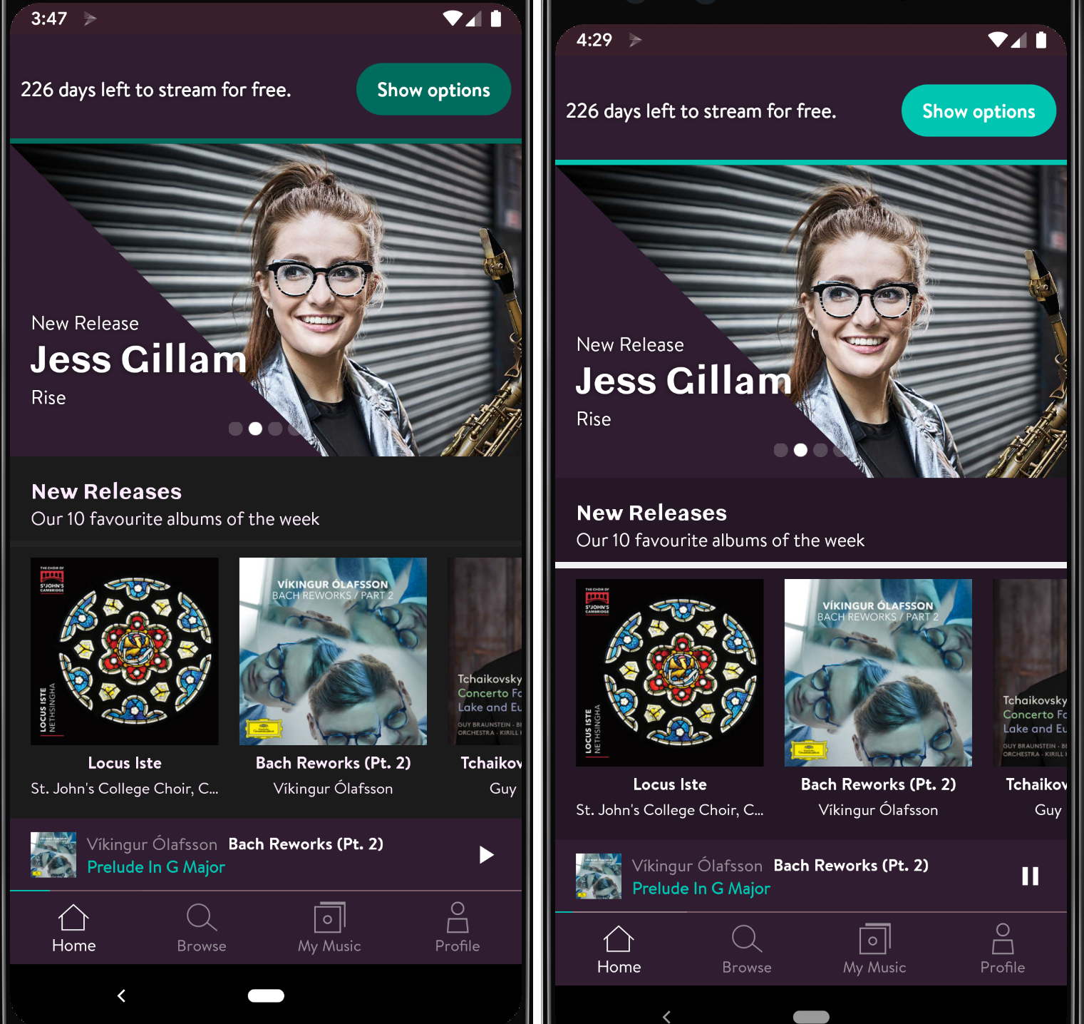
In addition to this, for all your custom colors and styles, you are able to use specific resource folders like drawable-night and values-night. In this way, you can perfectly fit the design to your company’s color scheme and your user’s wishes. For the Primephonic app, we’ve already made a first prototype of a tailored Dark Theme:

For example, on the left, the OS forced the app into some sort of pinkish text color for the “New Releases” title, on the right we set the same title to white using a custom night style.
Depending on your implementation, adding all colors and styles like this might be a tedious process, but you are in full control of the result.
Using a MaterialComponents theme
Instead of extending AppCompat, you could also use Theme.MaterialComponents.DayNight . Using a Material Components Theme unlocks new platform attributes, it provides many more attributes beyond the good old colorPrimary and colorAccent. DayNight is available from MaterialComponents version 1.1.0.
Implementing the DayNight theme
Now that we’re using the DayNight theme, we can take advantage of the flexible platform attributes. For example, using attributetextColorPrimary automatically switches your text color to dark or light, and also supports disabled states for both types.
<TextView
        ...
        style="@style/MyText" />
You can declare the MyText style in your styles.xml using the color attributes from the current theme:
<style name="MyText">
    <item name="android:background">?attr/colorSurface</item>
    <item name="android:textColor">?android:attr/textColorPrimary</item>
</style>
This toggles the color correctly when Dark Theme is enabled, but you probably want to apply your own colors to stay on brand. Hardcoding the color here would not switch it on Dark Theme. Let's create a custom styles.xml in your -night folder and specify the differences there. This means you reference the same theme from your Android manifest and change the attribute values according to the resource qualifier (‘night’). For example, in your values/styles.xml:
<style name="AppTheme" parent="Theme.MaterialComponents.DayNight">
    <item name="colorPrimary">@color/colorPrimaryDay</item>
</style>
And in your values-night/styles.xml:
<style name="AppTheme" parent="Theme.MaterialComponents.DayNight">
    <item name="colorPrimary">@color/colorPrimaryNight</item>
</style>
These two colors can now be defined in your colors.xml as you probably already do.
If you prefer, you could use two colors.xml files (instead of two styles files) that both specify a different value for colorPrimary. One of the advantages of two styles files, as done here, is that all changes stay in one place, since some of the assets and other resources might have a night variant too.
Using (system and custom) attributes with the DayNight theme instead of hard-referencing styles is the recommended way to style your app and support Dark Theme. With a solid theming structure that supports Dark Theme in place, it’s also not that hard anymore to support it!
Further Reading
To support in-app Dark Theme all the way back to API 14, check out this Google Dark Theme Example. To get started with more attributes and less hardcoded styles, check Best Practices for Themes and Styles. Google also provides a Dark Theme Material design guideline and there’s this design talk on Google I/O.
Also be sure to check out best practices for widgets and messages in the Dark Theme best practices section or check out the Google I/O video:
Check out our other Google I/O blog posts on https://engineering.q42.nl/tag/google-io.


